Comparison and Convergence of the Blank Space in Chinese and Japanese Graphic Design
-Focusing on the Expression of Blank Space in Poster Design-
Wenqian Xie
1, Won-Seok Kim
2*1
Division of Formative Design, Kongju National University
2
Division of Formative Design, Kongju National University
중국과 일본 그래픽 디자인에서의 여백의 비교 및 융합연구
-포스터 디자인에서 여백 표현을 중심으로-
혜문천
1, 김원석
2*1
공주대학교 조형디자인학부,
2공주대학교 조형디자인학부
Abstract Comparison and Convergence of the Blank Space in Chinese and Japanese Graphic Design This study discusses the philosophical foundation in Chinese and Japanese aesthetics. Most of the contemporary graphic designs in China lack influence or individual philosophy on aesthetics. In analyzing and comparing the use of blank-leaving in graphic design works showed that the traditional artistic sense of the blanks can enrich the cultural connotations of design and raise the artistic creation of the works. This paper used “convergence” to create a new approach on Chinese contemporary graphic design, especially on poster design. The application of blank-leaving in the graphic design has positive impact in the creation of excellent graphic design works that provide references and inspiration to develop a new blank on my own design.
• Key Words : Convergence, Blank Space, Zen and Tao, Graphic Design, Poster Design
요 약 중국과 일본 그래픽 디자인에서의 여백의 비교 및 융합연구
이 논문은 중국과 일본의 상이한 미적, 철학적 차이의 이해와 융합을 기반으로 그래픽 디자인 분야에서 여백을 통한 새로운 표현 창출을 위한 방법에 대해 논했다. 그래픽 디자인에서 동양의 특징적인 여백을 표현하는 것은 디자인의 예술적 표현과 문화적 의미를 풍부하게 하고 디자인의 창작의 가능성을 높을 수 있다. 이 연구에서는 먼저, 중국과 일본의 미술 및 디자인에서의 여백에 대한 인식과정과 표현과정을 중국의 전통회화의 철학과 일본의 현대 그래픽 디자인의 방법이 적용된 포스터 디자인을 통해 비교∙분석한다. 이를 기반으로 포스터 디자인에서 여 백을 통해 중국 현대 그래픽 디자인의 새로운 접근방법으로써 융합의 개념을 적용해 그래픽 작업에서의 표현의 가능성을 확장한다. 또한, 여백에 대한 융합적 개념에 의한 표현 창출은 자신의 작품에 새로운 가능성을 제공한다.
• 주제어 : 융합, 여백, 선(禪)과, 도(道), 그래픽 디자인, 포스터 디자인
*Corresponding Author : 김원석([email protected])
Received March 9, 2017 Revised April 17, 2017
Accepted June 20, 2017 Published June 28, 2017
1. Background and Introduction
In the recent years, China has recognized the importance of commercial graphic design as a means to strengthen the country's economy. As a result designers in China have worked to actively meet demands requiring high quality in graphic design. The contemporary graphic design field has undergone 20 years of development, achieving positive results in the process. Like all fields of specialization in the course of its development, it has experienced various different problems. The language of art and design flourished simultaneously with the emergence of different graphic languages and also with the enrichment of expressions in the genre. The creation of poster design in China often focused on graphics, use of text and other image elements but neglected the application of blank space.
In terms of producing a good design style certain areas require to be left empty as it directly affects proportion in the overall layout, size and placing of different graphics, images and others. Therefore the application of blank space whether it is a poster or something else is crucial. This is perhaps the focal point in the creation of graphic design as well as in understanding 2-dimensional space. Poster design is known as the most effective way of incorporating expression into the formal nature of graphic design. For Chinese contemporary graphic design, the use of blank space is a sign of maturity. This is helpful for the country to embody aesthetical implication of its culture in graphic design works, which has reflective significances on the current phenomenon that the design field in China can easily imitate the design language of the West.
Our daily living has become more complex as many people incorporate the art of simplicity into their lives.
The development of a country’s design approach can be said to be a reflection of daily life led by a specific culture. Visiting Tokyo has been eye-opening as the Japanese people, particularly in the urban context, used graphic design in a different way. Neon signs, billboards, and luminous screens caught attention and allowed the observer to swoon in wonder. The graphic
minutiae of the Japanese culture is equally compelling:
tickets, till receipts, food packaging, confectionery wrappers and printed ephemera of all kinds instantly become collectable items, encouraging visitors to take back a suitcase filled with evidence of superior visual culture. Comparing this to the reality of Chinese graphic design, it is possible to state that often they are crapped with too much information using graphic design, text, images and so on. For the viewers it is almost impossible to either identify or understand messages simultaneously as loosing the focal direction of design. With any merchandising strategy that requires to include certain details, confusion must be avoided as it will eventually affect the economy. The focus on aesthetics in graphic design is undeniably important. Simple designs easily attract the attention of people and everyday practical designs seen by the general public on a daily basis, indirectly influences the overall aesthetics of a particular culture. Moreover profound thoughts can be evoked through effective graphic design initiatives which will eventually elevate the general standard of living and the aesthetics of a country. Sometimes, it is difficult to understand design philosophies or intentions of designers in terms of their conveyance. Bearing all this in mind, it is crucial to experiment with open or blank spaces in graphic design as without the incorporation of space, there would be no beauty.
Consequently the psychology, in terms of a
country's aesthetics, is formed in its long-term social
practice. Through a long historical development, each
nation has established its own ideology, philosophy, and
tradition within its social environment. All have
significant influences on people’s consciousness and
behavior. Also, each element affects and cultivates the
national activities and characteristics in aesthetics. Li
Zehou, a Chinese aesthetician, stated that ‘Chinese
philosophy is not tending or peaking at religions, not
aesthetics. Chinese philosophy transforms cognition to
aesthetics, but not to religions, it is to gain an
aesthetics-oriented life design, attitude, and
conception’[1]. The thought of Zen Buddhism is rooted in the customs and emotions of Japanese people. The Zen way of thinking, and methods in aesthetics have gradually become the nation’s way of thinking and behaving. Certainly, the Japanese Zen Buddhism’s thoughts and aesthetics have been incorporated in their design works. In contrast, China is behind in this way, in the application and the cultivation of its national philosophical aesthetics in contemporary design, and in particular graphic design.
2. Contextual Review
2.1 The Blank Space in Traditional Arts of China
[Fig. 1] Chinese painting, Prown, Qi Baishi
Historically Chinese paintings were a reflection of the culture's philosophy and social transitions, as a result the aesthetical pursuit and value were depicted in paintings. Understanding the world with “Dao” impacts the cultural level of Chinese humanism. In traditional Chinese art, particularly classical paintings, much attention was given to propaganda along with self-expression based on emotion. The empty space in paintings is an in-depth understanding or practicing of
"Dao". Chinese philosophy and aesthetics also focuses on the notion of "nothingness", which is shown as empty spaces in paintings. Many painters have put emphasis on the empty space. In Chinese paintings, an empty space does not only set off the main feature but
also enhances concepts in aesthetics, such as the continuation of key elements in paintings. “Dao” is distant and spacious, containing within its belief the notion of infinite void.
The principles of traditional Chinese paintings derived from Daoism, which emphasizes the union of humanity and nature as shown in individual creativity.
Lao Zi stated, ‘Knowing the white, retaining the black, it is the form of the world’ (Laozi, Chapter 28). The white in Chinese paintings suggest emptiness, while blank signify solidity. In Chinese calligraphy, an empty space is used in ‘designing the white.’ In Chinese literature, it lies where it is without words. In music, silence creates more sound than actual sound itself. In painting, it is as if one’s mind can reach there without the touch of any brush and ‘formless conveys the image grander’ (Laozi, Chapter 41). In traditional Chinese paintings it was not necessary to fill an entire sheet of paper. It was more customary in practice to leave a section blank for viewers to imagine. “The great sound seems soundless; the great image seems formless” is the realization of noumenon of “Dao.” An ancient Chinese once summarized aesthetic forms by stating, “Beauty made relies on what is not visible to the eye." These blanks are called “white space.” They become a reserve for expressing the authors’ ideas, and a significant artistic technique for “virtual” serving of the “real,” “non-being” at the same time as supporting the “being.” Philosophically, the white space reflects on the relationship between “virtual” and “real,”
“in-motion” and “in-position” in paintings.
2.2 The Blank Space in Traditional Art of Japan
[Fig. 2] Japanese ink painting, six-panel pine trees,
Hasegawa Tohaku
The root of traditional Japanese culture and aesthetics has been largely influenced by Chinese philosophy and culture. Confucianism, Buddhism, and Taoism were introduced into Japan at different times.
Combining the belief of Chinese Confucianism, Buddhism, and Taoism with Japan's own inherent characteristics enabled the notion on “Zen” to develop and it is quite different from Confucianism, Buddhism, and Taoism. The understanding of “Zen” is the focal core in identifying Japanese aesthetics. Some western scholars even believe that the Japanese culture and character is Zen. It has played a critical role in the establishment of the Japanese character. It has touched on all levels of Japanese’s cultural life,[3] according to D.T. Suzuki, a Japanese scholar.
The early Japanese art was influenced by Zen Buddhism’s way of thinking, which came from India to China, then from China to Japan. The embodiment of such influence could be found in ancient Japanese scenic paintings having large white areas and simple outlines. The connection between Zen and art is important because of the inspiration that Zen gives to the artist and the better understanding of psychological conditions in art that is created prevailed in any other civilization [2]. The Zen school of Buddhism also stresses that ‘form is emptiness, emptiness is form.’
Kenya Hara, a Japanese contemporary graphic designer, cited white means “empty” in certain circumstances. White, as “no color,” translates into a symbol of “non-being.” Also, empty does not mean
“nothing” or “zero-energy.” In many cases, it refers to a state that will be filled in the future. Based on this assumption, “white” is regarded as “the powerful communication energy” in his own book [3].
3. Expression of Blank Space in Graphic Design
3.1 Japanese vs. Chinese in Graphic Design The Japanese have long practiced a conscientious and open-design aesthetics in all their creations to
accommodate limited resource and space. These are reflected in Muji’s advertising design. The modern Japanese graphic style evolved from many sources.
Japanese characters in their language originally derived from Chinese letters, which are logograms that represent the entire word, thus giving the written text a highly symbolic and idiomatic expression. It is a feature that can still be seen in Japanese graphics today. The designers of post-World War Ⅱ period were inspired by flat, asymmetric compositions with influence from the masters of the floating world, wood-block printing. Another influence was the tradition of Japanese family crests. Modernism and constructivism were also highly influential forces in the creation of modern Japanese graphic design [4].
D. T. Suzuki said, “We need to pay attention to some characteristics of Japanese art, which are inseparable from Zen Buddhism. That can be derived from Zen.”[5] Gang Seungkyoo, Future’s Keyword, Convergence. Century Daily News Media, 2009. Due to the infiltration of Zen aesthetics, Japanese art and design tend to be still and simple. All areas of daily life and culture were effected by the aesthetics based on Japanese Zen practices. Combining Zen concepts with design has been the most effective method for designers to express their own inherent cultural characteristics and experiences.
The simple form, complex logic, and profound
connotation constitutes the highest Japanese aesthetics
realm. Japanese designs with strong national themes
enhanced the struggle of Japanese designers to refine
core values in their own culture. Most Japanese graphic
designs attempt to use the void-arranged method
instead of traditional Western design, that tends to
follow solid-arranged concept. Layouts of Japanese
graphic designs are mostly asymmetry, which is
generally more active than symmetrical ones. By
contrast, Chinese graphic designers prefer to apply
symmetry in layouts in preliminary stages of planning.
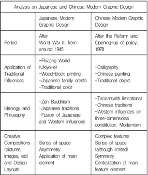
<Table 1> Compare and Contrast of Japanese and Chinese Modern Graphic Design
Analysis on Japanese and Chinese Modern Graphic Design Japanese Modern
Graphic Design Chinese Modern Graphic Design
Period After
World War II, from around 1945
After the Reform and Opening-up of policy, 1978
Application of Traditional Influences
-Floating World (Ukiyo-e) -Wood-block printing -Japanese family crests -Traditional color
-Calligraphy -Chinese painting -Traditional object
Ideology and Philosophy
-Zen Buddhism -Japanese traditions -Fusion of Japanese and Western influences
-Taoism(with limitations) -Chinese traditions -Western influences on three-dimensional constitution, Modernism Creative
Compositions (pictures, images, etc) and Design Layouts
Sense of space Asymmetry Application of main element
Complex features Sense of space (although limited) Symmetry Centralization of main feature element
Asymmetry is also a significant feature of Japanese traditional aesthetics, which comes from the concept of the spatial arrangement applied to traditional architecture. The garden and tea-room must be put in an essential place in traditional Japanese life style, embodying the basic characteristics of asymmetry layout. Traditional landscapes infiltrate Taoist’s free thoughts while and manifesting asymmetrical characteristics. However they were only limited to the royal and the powerful class of people, evidently the general public could not experience such aesthetics.
The tea gardens and the tea-rooms are also intentional forms deliberating asymmetry and unevenness. In contrast to the fullness of symmetry, asymmetry is an affirmation of imperfect forms and incomplete beauty.
In terms of layout design in modern and contemporary Japanese graphic design, the same principles are practiced.
3.2 Japanese vs. Chinese Graphic Designers Koichi Sato is a modern Japanese graphic designer.
Wang Shouzhi, a Chinese design theorist, described
Sato by stating, “he conveys the stillness, inaction, and plain, which emphasizes self-cultivation and pays attention to the spiritual realm of purity and emptiness.
His posters are regarded as a visual carrier of the Japanese culture and Zen Buddhism thoughts on his creation” [6]. In the rapidly changing world of global design, Sato has found an integrating point based on concept on nature, color theory, and aesthetics rooted in Japanese Zen Buddhism. From Sato’s posters, one is able to see the impact transmitted by Zen thoughts to create finesse and stillness using details and tranquil elements in emotional expressions.
Kan Tai-keung is a modern Chinese graphic designer who always focuses on Chinese culture and learning additionally as aesthetics.
<Table 2> Compare and Contrast of Representational Graphic Designs of Japan and China
Comparing Japanese and Chinese Graphic Designers
Posters by Designers
Koichi Sato(Japanese) Kan Tai-keung(Chinese)
Philosophical
Basis Zen Buddhism Taoism
Traditional
Elements Traditional objects Traditional color
Chinese calligraphy Chinese painting Traditional objects Creative
Compositions Overall planning Centralized planning
Placing Asymmetry Symmetry
Color Japanese traditional color Traditional color based on Chinese ink brush painting Artistic
Tendency Zen-like stillness Confucianism, Buddhism, Taoism