ABSTRACT
The appropriate plot effectively conveys the author's conclusions to readers. Journal of Korean Medical Science will provide a series of special articles to show you how to make consistent and excellent plots easier. In the first of this series of special articles, I will cover Kaplan-Meier curve (or Kaplan-Meier plot) and the ease tools. This plot, generated as a result of the Survival Analysis, provides a visualization of the ‘Kaplan-Meier Survival Probability Estimate’ for each group.
Keywords: Kaplan-Meier Curve; Survival Probability Estimate; Survival Analysis
INTRODUCTION
The Kaplan-Meier method is used to calculate the Survival Probability Estimate while conducting the Survival Analysis.1 The Kaplan-Meier curve is visualized by this method.
Common statistical programs draw this, but it is cumbersome to draw to show all the necessary information neatly and easily. Authors sometimes want to express the 95%
confidence interval (CI) of the Survival Probability Estimate, and Journal of Korean Medical Science (JKMS) recommends censored data and number at risk.
METHODS
First, visit the site.2-4 The example data ‘lung’ is pre-loaded (1). The example has three field names (2): ‘time’, ‘event’, and ‘groups’ (Fig. 1).
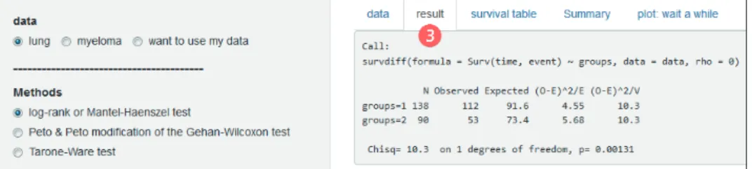
In the ‘result’ tab you will see the statistical results (3). The most commonly used ‘log-rank or Mantel-Haenszel test’ appears by default. A menu is provided in ‘Methods’ to select ‘Peto &
Peto modification of the Gehan-Wilcoxon test’ and ‘Tarone-Ware test’ (Fig. 2).
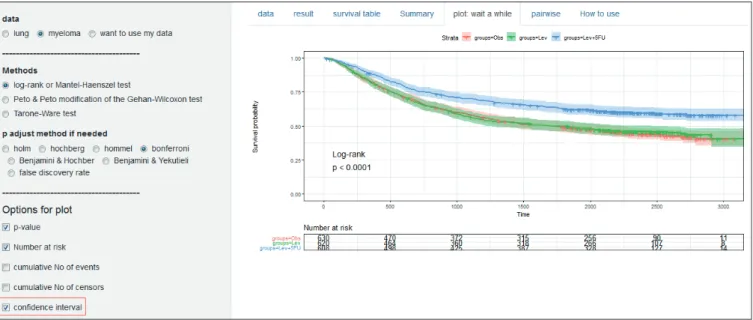
The ‘plot’ tab draws a Kaplan-Meier curve and (4) options in ‘Options for plot’ are on the left.
It is almost always necessary to properly adjust the ‘time interval for x axis’ to fit your time unit. The remainder will not require editing in most cases (Fig. 3).
Received: Dec 3, 2018 Accepted: Dec 20, 2018 Address for Correspondence:
Jeehyoung Kim, MD
Department of Orthopedic Surgery, Seoul Sacred Heart General Hospital, 259 Wangsan-ro, Dongdaemun-gu, Seoul 02488, Korea.
E-mail: [email protected]
© 2019 The Korean Academy of Medical Sciences.
This is an Open Access article distributed under the terms of the Creative Commons Attribution Non-Commercial License (https://
creativecommons.org/licenses/by-nc/4.0/) which permits unrestricted non-commercial use, distribution, and reproduction in any medium, provided the original work is properly cited.
ORCID iDs Jeehyoung Kim
https://orcid.org/0000-0003-3380-1683 Disclosure
The author has no potential conflicts of interest to disclose.
Jeehyoung Kim
Department of Orthopedic Surgery, Seoul Sacred Heart General Hospital, Seoul, Korea
Fig. 1. First screen showing ready sample data.
Fig. 2. The ‘result’ tab showing the results of the log-rank test and the menu for selecting different statistical methods.
Fig. 3. The ‘plot’ tab showing Kaplan-Meier curves and options for Kaplan-Meier curve.
disable the ‘CI’ (Fig. 5).
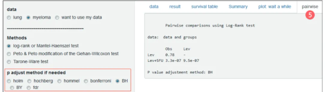
Comparing multiple groups requires post-hoc pairwise comparisons. You can see it by opening the Pairwise tab (5) and you can specify ‘P adjust method’ (Fig. 6).
The survival table and the Summary tab also have important information, but this article focuses on plot, so I will not go into details.
Fig. 4. Options for downloading plot as PDF.
Fig. 5. Options for ‘CI’ of the Kaplan-Meier curve in the ‘myeloma.’
CI = confidence interval.
Some options are available depending on the needs of other authors. The median survival time can be displayed on the plot via the ‘horizontal/vertical line at median survival’ option (Fig. 7).
You can draw various plots through the options of ‘cumulative events,’ ‘cumulative hazard function’ and ‘survival probability in percentage’ (Fig. 8).
When you upload your data, you must put the three field names ‘time,’ ‘event’ and ‘groups’ in Excel and save it as csv file. Select ‘want to use my data’ and click ‘Browse’ to upload (Fig. 9).
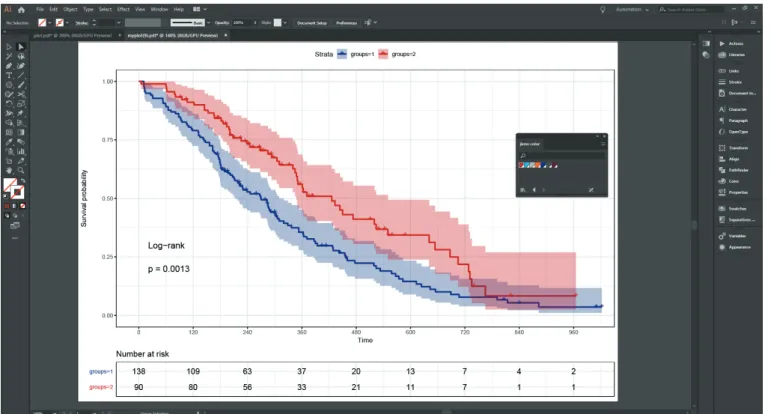
You do not need to worry about fonts or font sizes. Most level journals, including JKMS, redraw the plots. This is because journals have unique colors and fonts. Therefore, if you send a PDF file after specifying the size of the image, they will be able to publish it with appropriate processing (Fig. 10).
This plot is created by using one of the R packages, survminer.5 Fig. 6. Results and options of post-hoc pairwise comparisons.
Fig. 7. Median survival time line.
Fig. 8. More various plots.
Fig. 9. Menus for uploading your own data.
Fig. 10. After editing according to Journal of Korean Medical Science form.
REFERENCES
1. Kaplan EL, Meier P. Nonparametric estimation from incomplete observations. J Am Stat Assoc 1958;53(282):457-81.
CROSSREF
2. Survival analysis. https://data-play3.shinyapps.io/compare_KM_curves/. Updated December 16, 2018.
Accessed December 16, 2018.
3. Survival analysis. https://data-play7.shinyapps.io/compare-KM/. Updated December 16, 2018. Accessed December 16, 2018.
4. Survival analysis. https://tinyurl.com/compare-KM. Updated December 16, 2018. Accessed December 16, 2018.
5. Kassambara A, Kosinski M, Biecek P, Fabian S. Survminer: drawing survival curves using ‘ggplot2’
R package version 0.4.3. https://CRAN.R-project.org/package=survminer. Updated 2018. Accessed December 16, 2018.