ISSN: 1738-7167
DOI: http://dx.doi.org/10.7731/KIFSE.2016.30.3.138
한국형 구급차 색상 디자인 연구 및 동향분석
박민정 · 김형욱 · 정재한* · 한용택*
†
4DM, * 한국소방산업기술원
A Research on the Korean Ambulance Color Design and Trend Analysis
Min-Jung Park · Hyung-wook Kim · Jae-Han Jung* · Yong-Taek Han*†
4DM
*Korea Fire Institute
(Received June 1, 2016; Revised June 20, 2016; Accepted June 20, 2016)
요 약
국가적 사회적 차원에서 국민의 안전과 보호에 대한 서비스의 인지가 사회 전반적으로 확산되어감에 따라 경상 환자, 상황이 급박한 중상환자까지 구급차 이용의 빈도수가 점차 증가하고 있다. 그러나, 구급차 이용의 빈도수가 증가함에 따 라 이송 중 안전사고도 빈번해지고 있다. 이와 같은 원인은 신속하게 환자를 이송해야하는 구급차가 도로를 포함하여 구 급차가 노출되는 환경에서 인식이 잘 되지 않을 뿐만 아니라, 이미 매우 높은 확률의 2차 사고에 노출 되어있다는 것이 고, 이는 환자를 포함하여 구급대원에게도 생명이 담보된 위협적인 상황이라 할 수 있다. 특히 흐린 날이나 야간에 도로 상의 구급차는 무방비 상태로 사고에 완전히 노출되어 있으므로 안전사고 대비를 위한 안전한 디자인의 연구 및 개발은 매우 시급하다고 할 수 있다. 또한, 구급차를 보다 원거리에서 인식이 되는 시인성이 높은 색상과 위급함을 직관적으로 인지할 수 있는 디자인 모티브를 추출하여 구급대원과 환자가 주변 환경으로부터 안전하게 보호 될 수 있으며, 현대감각 에 맞는 연출로 구급차로서의 정체성을 살리고, 예민하고 불안한 환자의 심리상태를 고려하여 시각적으로 올 수 있는 위 압감을 완화시킬 수 있어야 한다. 따라서, 본 연구에서는 기 연구된 선진 해외 사례를 분석하고, 국내 환경에 맞는 색상 을 연구하여 이제까지 구급차에 대한 고착화 되어버린 색상에 대한 선입견을 버리고, 보다 안전한 색상 연구의 필요성을 파악하여 실제 한국형 구급차에 적용된, 현재 구급자동차 외관의 색상 및 패턴을 포함한 외관디자인이 나오게 된 과정에 대한 연구 결과이다.
ABSTRACT
As services for citizens’ security and protection offered at the national and social levels become more widely recog- nized across society, the more frequent use of ambulances by patients with both minor and major injuries is being observed. However, the number of safety accidents during transport by ambulances, which are responsible for the prompt transport of patients, has been rising in tandem with the increase in their use. This is due not only to their inconspicuous- ness both on the road and in other environments where these vehicles are exposed, but also to the high chance of second- ary accidents, putting the lives of both patients and emergency responders at risk. It is important to study and develop designs that guarantee protection against safety accidents, noting that ambulances are completely exposed and unpro- tected on the road on cloudy days and at night-time. In addition, by identifying colors and design motives that enhance the conspicuity of ambulances from a distance and increase their security, emergency responders and patients can be safely protected, the identity of the ambulances can be reinforced and modernized, and the sense oppression which can be visu- ally imposed on patients in a psychologically unstable condition can be eased. Against this backdrop, this study presents the process involved in deriving the exteriors of ambulances in Korea, including their colors and patterns, by examining the established global best practices and identifying the need for more studies into colors, even unconventional ones, that improve their safety.
Keywords : Ambulance, Color design, Pattern image, Reflective sheet
1. Introduction
An ambulance is a vehicle equipped for transportation of
injured or patients to hospitals in emergencies. Ambulances account for majority of fire-fighting vehicle dispatches and serve a leading role in providing civil service. Notable
†
Corresponding Author, E-Mail: [email protected]
†
TEL: +82-31-289-2957, FAX: +82-31-287-9067
aspects of ambulances include that they are equipped with special and compression bandages, a tourniquet, respirator and oxygen injector, and other emergency medical sup- plies. A doctor does not ride together, but a team of two - nurses or paramedics - handle the responsibility of trans- porting of and providing emergency aid for the patient. The vehicle also features communication devices for transport- ing the patient to the nearest hospital with an emergency room and is supported by a trained paramedic, capable of providing emergency aids, preventing the patient’s symp- tom from aggravating(1,2).
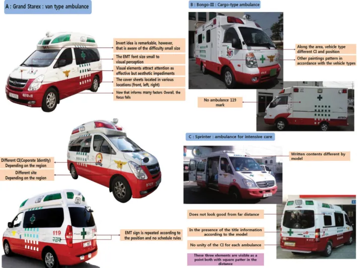
Three types of ambulance models are currently used in Korea - a van type ambulance using Grand Starex, a truck type ambulance using Bongo III and intensive care unit ambulance using Mercedes-Benz Sprinter(3-5).
However, following weaknesses have been found in exteriors of ambulances. In van types, the font-size applied on the National 119 Rescue Service is too small, thus lack- ing readability, and reverse lettering on the front of the
vehicle is a smart idea but not visible enough. Tiles work as attention-drawing visual elements but compromise the look. The logo of the National Rescue Service is placed on multiple places, and over-use of message elements are resulting in a lack of focus in general. There are identity elements that vary by region, and there is no rule on place- ment of logos on the vehicle.
In truck types(6), weaknesses in exterior design include inconsistency in the type and number of the logos applied.
Position of identity application is also not consistent across vehicle types, and no 119 ambulance logo is applied. In case of ambulance models that use a foreign car model, which and where representations are made were different, and those representations were not easily identifiable from a distance. Based on the analysis of the exterior design, 119 ambulances in Korea have been found to employ red as the main color which is the identity color of fire-fighting and use white for the upper half and red for the lower half of the body. Logo format is varied by vehicle type and region,
Figure 1. Weakness of Korean ambulances in exterior image.
lacking a sense of consistency. There was also an absence of uniformity in the tone of the red and sheets used and the identity of the National 119 Rescue Service identity. It is critical that color schemes be identified with a scientific approach to guarantee users of ambulances and paramed- ics of safety and measures to ensure nighttime visibility.
Figure 1 illustrates weaknesses in exterior designs of ambu- lances in Korea.
Meanwhile, looking at the color design status of an over- seas ambulance as follows. First, colors of orange and red color series are primarily stand out, using a speedy graphic elements, gradation also red color pulse are widely used in Germany.
And, red, yellow, blue color is preferred also used the Battenberg pattern and Chevron mark of the European tra- dition but blue series is likey to be mistaken for a vehicle such as when police boarded the domestic, full red paint could be distinguish with 119 fire trucks in case of fire in France. Not only orange, green and yellow color are mainly used, but also traditional European Battenberg pat- tern and Chevron mark are used in the United Kingdom and Switzerland. In addition, When it is displayed on a vehicle only needs, front and right side was identified as a high readability. However, red color series is less used, Figure 2 shows the image of foreign ambulance about this analysis.
In this light, this study aims at analyzing ambulance images and preparing an improvement plan while suggest-
ing color, design and paint specifications and their stan- dard guidelines. The objective also includes identifying familiar and friendly images, and thereby maximizing the brand value of 119(7). This can be achieved by improving the colors and designs of ambulances, upgrading designs for more familiarity and practicality in line with the evolv- ing trends in the 21st century while providing a stronger sense of familiarity and stability by symbolizing the 119 ambulances’ image of life protection and achieving unifor- mity in fire-fighting mark, CI and characters.
2. Method
2.1 Research methods
This study aims at driving three strategies to establish index and goals that contribute to building a stronger brand and values of 119 ambulances: maximizing the identity and brand value of 119, establishing a scientific color scheme, and identifying designs to achieve better visibility, senti- ment and service. In addition, the results related with 119 ambulance have had to be derived for the symbolism and compatibility of the field through the close cooperation and discussion with NEMA (national emergency management agency) rescue and EMS division officers, who has a long field experience and oversees all attempts of the 119 emer- gency services.
First, establish an image that helps safe-guarding para- medics and patients from harms by enabling the rescue ser-
Figure 2. The picture of traditional European ambulances.
vice to be recognized from a distance with a design that employ highly visible colors. Second, identify colors and design motives that appeal with a sense of familiarity and friendly image and trust-building designs that lessen the overpowering visual image with a modern-touch. Third, apply designs that emotionally appeal the identify of the National 119 Rescue Service but that lead pedestrians and drivers to give way for transporting patients with a sense of emergency but without agitation.
The study analyzed colors to set forth a guideline for exterior colors of ambulances based on the following prin- ciples: avoid monotonousness by using a combination of 2- 3 colors, suggest colors with high conspicuity but which blend well with the surrounding environment, apply fire- fighting identity colors and use colors and patterns which ensure safety by allowing the vehicle to be recognized from a distance.
As for colors used for the design, select distinctive col- ors for road safety and apply color therapy for psychologi- cal stability and healing. Colors used in public spaces and facilities need to be approached in environmental, psycho- logical and cultural perspectives, and color identity for vehicles should highlight the identity itself, intrinsically, and distinction, extrinsically. This study targets at achiev- ing global competitiveness in designs with color designs and schemes befitting for the Korean environment while improving and strengthening the brand of a government agency(8).
2.2 Status & analysis
The findings from the analysis on the exterior color of
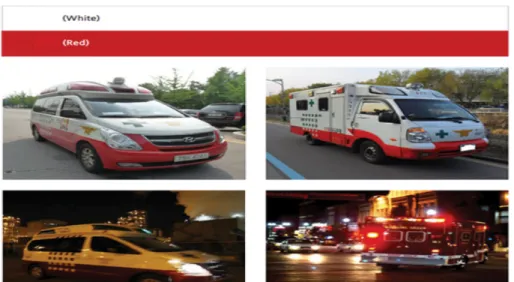
today’s 119 ambulances in Korea suggest that red, the fire- fighting identity color, is being used as the main color;
white is being used for the upper half of the vehicle body, and red, for the lower half. There was a lack of consis- tency in the logo and lettering formats by vehicle type and region. There was also no uniformity in the tone of the red and sheets used, with absence of the National 119 Rescue Service identity. It is critical that color schemes are identi- fied scientifically to guarantee users of ambulances and paramedics of safety and measures to ensure nighttime vis- ibility.
Meanwhile, global reference cases illustrate employment of oranges and greens, aside from red, and use of chevrons and Battenburg patterns that call for attention. Also, in some cases, only key elements were being presented, help- ing fast recognition of the ambulance. Life-support images such as an image of pulse were being used, and day-/night- time visibility was being obtained using retro-reflective sheeting.
Figure 3 demonstrates images of postal trucks in Korea.
It shows use of red shades which is akin to the fire-fighting identity color. Their C.I, which was just renewed recently, guarantees high conspicuity and shows a use of bright orange and graphic patterns that convey speediness. Red shades are also popularly used by private companies to visually appeal for marketing during transport. DHL achieved strong visibility by painting the entire body in amber with logo lettering in red which is visually stimulating and pro- vides better visibility with dynamic contrast achieved with a use of a complementary color of the background color.
Against this backdrop, this study has eliminated red
Figure 3. Exterior images of postal trucks in Korea.
shades to the extent possible for better distinction from ambulances operated by general hospitals and other cou- rier and delivery vehicles. The finding also suggested that use of stripes or diagonal patterns may misidentify the vehicle as a courier truck, and that use of yellow or green
over the entire body for the sake of visibility may make the vehicle to be mistaken for a ride for children.
2.3. Application of color design
According to the exterior color analysis of 119 ambu- lances as illustrated in Figure 4, 119 ambulances in Korea use red for the main color in the lower part of the body and white in the upper part of the body. In general, red gives visual stimulation in a design aspect, but comes with low conspicuity. Red is often seen as brown or black during night-time and excites the emotions, downsides which can make the color inappropriate for patients or their guard- ians. On the other hand, yellow-green is proven to offer the highest level of conspicuity of all colors in nature. In fact, global reference cases suggest drastic decrease in road acci- dents after the color of ambulances have been replaced with yellow-green. This color is also being widely used for vehicles for child-protection. Figure 5 demonstrates fire trucks around the world showcasing utilization of a mix- ture of various colors.
3. Result
This study shows the exterior color and design process development of the 119 ambulances currently in use by the standard of 119 ambulance criteria paint guideline for color design with effect from January 2014. Furthermore, the color design was applied to the exterior of the van type (Grand-starex) and freight type (Bongo III) of 119 ambu- lances in accordance with the above criteria through the close cooperation and working with the director of the 119 emergency services of the NEMA (national emergency Figure 4. Exterior images of ambulances and fire trucks in Korea.
Figure 5. Fire-fighting trucks around the world using vari- ous color combinations.
management agency), so it could be developed effectively.
3.1 Result of design research on exterior colors Figure 6 illustrates images that have been analyzed based on various color spectrums. In (a) of Figure 6, red, a tradi- tional color that represents emergency service which has been in use for the last 30 years, was applied. This color can be easily identified by the users in Korea and is known to be the most visually stimulating. Red can easily catch attention amidst other colors, but has a downside of being mistaken as brown or black during right-time and excites emotion. For a point of improvement, a color tone which guarantees night-time visibility but that offers a sense of assurance to patients should be selected. (b) is orange, a color with significant impact on emotion, and which has a power of invigorating the body and mind. This color is similar to red which symbolize fire-fighting and comes with a high level of conspicuity. The color is uplifting and light but its night-time conspicuity is relatively low, although better than red. The yellow used in (c) is charac- terized as a color which stimulates a sense of movement and generates energies used for muscles. Yellow is one of colors that offer strong conspicuity and exudes cheerful and bright energy, but can make the vehicle to mislead as a vehicle intended for child-protection.
Blue is used in (d). Blue is known to boost metabolism, revitalize, stimulate growth and slowdown the heart rate.
This color is favored by many people and provides a sense of coolness and trust and conveys an image of enforce- ment such as a police car, however, has a weakness in night-time conspicuity. Navy, applied in (e), tends to cre- ate tension and cools down the heat, and conveys an image of enforcement and strong authority. However, it can be seen as black in night. (f) is violet, a color that alleviates symptoms of mental disorders and balances the ions that produce white blood cells, thus helping one to maintain emotional stability. Historically, the color has been used by royal families, and is appropriate in that it provides an artistic impression and a sense of entertainment, yet, has low visibility at night. (g) has a comforting effect for the eyes and minds. Green represents earth and nature which can remind of eco-friendly cars, therefore, has to be used with careful deliberation. (h) is yellow-green, the color proven to be effective in helping one to restore bodily sta- bility from traumatic and shocking incidents. It has the most conspicuity in a natural environment in both indoors and outdoors in rain. This color, however, is considered not authoritative enough in circumstances when patients and guardians have to follow the instructions of paramedics.
3.2 Result of pattern design study
In this study, representative patterns such as those shown in Figure 7 were found, with respect to a guideline on exte- rior colors used for ambulances. They included images that (a) represent life-protection and life, (b) convey urgent situ- ation, (c) imply emergency situation and (d) those that symbolize emergency, urgency and life at the same time.
Also, patterns that (e) capture attention were found.
Pulse herein refers to heart rate. The pulse image is widely used on ambulances both in and outside of Korea as it represents pressure changes in intravascular flow or vibration of vascular walls. Heart expresses love as a vital organ that works as the driver of the circulatory system.
Life-star is always popularly used as a symbol for Emer- gency Medical Services (EMS).
Figure 8 demonstrates various models of vehicles on which chevron patterns that demand and capture attention are applied. And a conclusion could be drawn that apply- ing such designs would work positively on the exterior image of ambulances in Korea.
3.3 Ambulance design direction outcome
This study has defined yellow-green midway between lime and lemon for the guideline on the exterior color of ambulances. The table below is the actual color-mix for- Figure 6. Exterior images of ambulance with various colors
applied.
mula, and contiguity colors are also presented for cases where the color has to be used by referencing conventional color swatches. Table 1 provides the color formula used for the yellow-green (①, ②) and the white (③).
Table 2 defines a bright yellow-green as the color for ambulances. Process color refers to a color scheme com- posed of 4 colors required for printing (Cyan, Magenta, Yellow, Black); Pantone color refers to a unique number assigned for each color in the system; RGB represents the intensity of red, green and blue; and HSB describes hue, saturation and brightness used for expressing the colors used on 119 ambulances.
In Figure 9, exterior colors have been defined by adding a color design which can represent incumbent identity color for fire-fighting which is composed of red and white(a). A Figure 7. Representative pattern images used on exterior colors of ambulances.
Figure 8. Examples of chevron patterns used on vehicles in other countries around the world.
design element has been also added to the exterior by using a graphic image of electric power or a current which gener- ates a large amplitude in a moment or an electro cardio dia- gram that symbolize life or urgency(b).
As an outcome, the following exterior design for Grand Starex was obtained as illustrated in Figure 10 To give a symbolic representation, yellow-green was applied to the bottom part of the vehicle, and white and red, a color com- bination that indicates fire-fighting, was used on the upper
section of the vehicle. A pulse graphic strikes across the body to give a sense of emergency with a use of chevron pattern on the rear to call for attention of surrounding vehi- cles, thereby achieving the color schemes and image por- trayed by traditional ambulances.
3.4 Result of reflective sheeting on ambulance Reflective sheets for automobiles are exclusively designed for signage on vehicles to help increase its conspicuity and Table 1. Color Formula Used for Yellow-green Ambulance
Company name Pigments Color Contents
Hoechst Hostapermgelb H4G Brilliant Yellow 100 g
Zenaca Monastralgrum GBN Trns Green 0.4 g
Kronos Kronos2310 White
Table 2. Process Color Used for Yellow-green
Bright yellow-green Process Color Pantone 381C Pantone 380C
CMYK
C 10 13 20 13
M 0 0 0 0
Y 90 100 91 72
K 0 0 0 0
RGB
R 240 234 218 233
G 234 230 225 233
B 12 0 27 95
HSB
H 58.42 58.97 62.12 59.2
S 95 100 88 96.58
B 94.12 91.76 88.24 91.76
Figure 9. Identify color for fire-fighting and ambulance graphic elements in Korea.
prevent crashes that involve heavy-duty vehicles during night-time driving. These are applied on vehicles that require guarantee of safety such as ambulance to inform other driv- ers of the coordinate, speed, distance and size of the vehi- cle as a means to effectively prevent potential accidents in night-time. As demonstrated in Figure 11 ultra-retro-reflec- tive taping was done around the upper part of the side and rear of the vehicle to allow estimation of overall height while ordinary reflective sheeting was applied for 119 ambulance patterns and marks.
However, as reflective sheets that belong to the same product group have a huge gap in the coefficient of retro-
reflection between white versus red, white reflective sheet- ing with a relatively higher level of coefficient of retro- reflection was applied along the edge of the red sheeting, the color which expresses fire-fighting identity, for the pulse pattern on both sides of the vehicle to enhance its identifi- ability on the road.
Also, ultra-retro-reflective sheeting was applied on the bottom sides of the vehicle on which the most intensive amount of headlight beams is shed, allowing the coordi- nate of the ambulance to be recognized promptly.
Reflective sheets were pasted on the roof as well, as pre- Figure 11. Exterior image of an ambulance with reflective sheeting for automobiles.
Figure 10. Exterior image of an ambulance using Grand Starex.
Figure 12. Exterior image of an ambulance with reflective sheeting.
sented in Figure 12(a). Only generic sheeting was used for the red pulse pattern to block interference between reflec- tive sheets when approached by heli-ambulance with extremely luminous search light. Reflective sheeting was used for outlining the National 119 Rescue Service pattern only for identification of the vehicle from the air. Figure 12(b) shows how they have been applied on ambulances operated in Korea.
4. Conclusion
This study aims at improving color designs of ambu- lances in Korea in line with the trend. The result of the study has been derived by primarily using interviews with paramedics who are the actual users and related materials due to insufficient availability of research papers on the subject in and outside of Korea, and where available, inter- national research papers and other analysis data.
1. Yellow-green has been selected as the color of choice for exterior colors for ambulances, the color which is char- acterized as the color proven to be effective in helping one to restore bodily stability from traumatic and shocking inci- dents. It has the most conspicuity in a natural environment in both indoors and outdoors in rain, however, is consid- ered to lack in authoritative image in circumstances when patients and guardians have to follow the instructions of paramedics.
2. Various patterns were studied to convey ambulance image. A pulse image was used to express cardiovascular pressure and heart.
3. Exterior image was enhanced by using retro-reflective sheeting to offer better conspicuity of ambulance. Also, their application was made with differentiation; ultra-retro- reflective sheeting was used on the upper sections of the side and rear of the vehicle to allow estimation of overall height while ordinary reflective sheeting was applied for
119 ambulance patterns and marks for better conspicuity.
4. Reflective sheets were pasted on the roof as well.
Generic sheeting was used to block interference when approached by heli-ambulance with a search light in the air, achieving an exterior image that allows the ambulance to be recognized from the sky.
References
1. I. S. Yu, K. H. Lee, T. Huh and Y. H. Yu, “Ambulance Standard and Revised Emergency Regulations for Trans- porting up Research”, Research Report Department of Health and Human Services of Chung-Nam Univ. (2011).
2. J. S. Chung, K. J. Hong, S. D. Shin, K. J. Seo and K. J.
Song, “Evaluation of the Apporopriateness of Prehospi- tal Emergency Care by 119 Rescue Services in Seoul Metropolitan Area”, Journal of Korean Society of Emer- gency Medical Services, Vol. 19, No. 3, pp. 233-244 (2008).
3. National Emergency Management Agency, “Safety Train- ing”, http://www.nema.go.kr (2013).
4. K. N. Jang, “A Study to Improve Ambulance Service in Quality”, Dong-Shin Univ. Master’s Thesis (2010).
5. 119 Magazine, “119 Emergency Service Satisfaction”, Vol. 12, No. 6, pp. 100-101 (2008).
6. I. S. Yu, K. H. Lee, T. Huh and Y. H. Yu, “Ambulance Standard and Revised Emergency Regulations for Trans- porting up Research”, Research Report Department of Health and Human Services of Chung-Nam Univ. (2011).
7. D. M. Shin, S. Y. Kim and Y. T. Han, “A Study on the Comparative Analysis of Fire-Fighting Ambulances about the Aspects of Safety and Efficiency using the Question Investigation”, Korean Inst. Fire Sci. Eng., Vol. 29, No.
2, pp. 44-53 (2015).
8. A. Roberto, C. Giuliana and M. Daniela, “Supporting Decision Making to Improve the Perform of an Italian Emergency Medical Service”, Annals of Operations Research, Vol. 236, No. 1, pp. 131-148 (2016).