1. Introduction
Studies on climate change as an offshoot of global warming are under way worldwide. The study subjects can be divided into the factors that influence climate change, the resulting climate changes, and the phenomena caused by climate change. Studies are being conducted in other countries to scientifically visualize the phenomenon of climate change and the factors that influence it on the virtual globes.
The Chollian satellite (Communication, Oceanographic, and Meteorological satellite, COMS) was successfully launched on June 27, 2010. For
approximately seven years, it is expected to perform its communication, oceanographic, and meteorological duties (Yang, 2011).
With the increasing interest in the global- environment changes, including global warming, the changes in the climate need to be scientifically visualized to provide the data needed for climate monitoring and for the formulation of policies to prevent or mitigate meteorological disasters. Studies are being conducted to enable the COMS data to be used for diverse sectors. The scientific visualization of the COMS data will provide the environment for studying the effects of climate change, and will
A Study on the 3D Visualization of Typhoons Using the COMS Data
Tae-min Kim*†, Jin-woo Choi*, Jin-woong Park*, Hyo-Min Kim*, Sung-nam Oh** and Young-kyu Yang*
*Dept. of Computer Science, Kyungwon University
**Yonsei University
Abstract : The satellite Chollian was successfully launched on June 27, 2010 and is expected to perform its communication, oceanographic, and meteorological duties for seven years. The follow-up launch of the Chollian satellite is already being planned, and diverse studies are under way to enable the use of the Korean satellite data. Studies are also being actively conducted in and out of Korea to visualize the meteorological data on the open-source virtual globes. The meteorological data include ground observation, satellite, and digital-model data. In this study, an efficient three-dimensional technique was developed to visualize typhoons on the virtual globes using the Chollian satellite data. This study was conducted to provide service to the public via the scientific visualization of the satellite image data, and to create an efficient satellite image analysis environment for meteorological researchers.
Key Words :
COMS, Visualization, Google Earth, HDF, TyphoonReceived October 26, 2011; Revised November 26, 2011; Accepted November 27, 2011.
†Corresponding Author: Tae-min Kim ([email protected])
strengthen the national policies on air monitoring and the measures for preventing or mitigating meteorological disasters.
This study was conducted to develop techniques for the 3D visualization of typhoons using the COMS data on the virtual globes.
2. Relevant Studies
1) Chollian satellite
Chollian is a multifunctional GEO satellite that performs meteorological, oceanographic, and communication duties. Its meteorological duties include the observation of the meteorology of the full disc, northern hemisphere, southern hemisphere, Asia-Pacific areas, Korean peninsula, etc. Chollian promotes cooperation with the climate studies in other countries, and enables the early and accurate observation and forecasting of the deteriorating weather conditions in Korea, including yellow dust, local downpours, heavy snowfalls, and typhoons. The
payload for meteorological observation has one visible band channel (1 km resolution) and four infrared band channels (4 km resolution), which allow the satellite to perform observation 24 hours a day. It also performs ocean observation (Yang, 2011).
Fig. 1. MI scanning modes and the area covered from each mode. Where, FD is Full Disk, APNH is Asia Pacific Northern Hemisphere, ENH is Extended Northern Hemisphere, LSH is Limited Southern Hemisphere and LA is Local Area respectively (K.
W. Jin et al. 2011).
2) Google Earth
Google Earth is the world’s first satellite image map service that provides the whole world regions information including satellite images, maps, topography and 3D building information and so on. A three-dimensional simulation is possible by placing them on Google Earth 3D space with converting various meteorological data into the KML (Keyhole Markup Language) form. At May 28th in 2008, Google released a plug-in for a browser of Google Earth and Javascript API (Choi and Yang, 2009).
□
- Total functions that play roles such as creating instances or events handling etc.
□Browser Plugin-specific Interfaces - Interfaces that directly control Google Earth
□KML-based Interfaces
- KML-based interfaces that are mostly inherited into Browser Plugin-specific interfaces
3) Meteorological-data visualization trend
There are diverse types of climate change data, and they are visualized together to ensure diversified analysis. Many climate-related organizations in the world (e.g., IPCC, UNFCCC) are cooperating with Google to study and provide the service of visualizing
Fig. 1 shows the observation area of Chollian satellite and its5 kinds of observation modes such as LA, APNH, ENH, LSH and FD depending on the area of an observation region (Jin et al., 2011).
meteorological and climate change data.
Unidata is an institute under UCAR (University Corporation for Atmospheric Research) and is a member of UCAR Community Programs. It provides diverse visualization programs, including GEMPAK, IDV, and McIDAS, which can be used to visualize the weather and climate data. The developed visualization technologies include digital weather forecast model visualization, which shows oceanic- surface data together with diverse climate change data such as the jet stream; visualization of diverse satellite images using the satellite image data in the local files and remote ADDE servers; and visualization of the animation of yellow-dust transport and diffusion.
Hadley Center, which is part of the meteorological office of the U.K., was established in 1990. It studies climate change models to provide various simulated visualization results, and it contributes to the policymaking on the worldwide climate changes. In addition, it forecasts the worldwide climate changes and provides visualization services (e.g., simulation on the virtual globes).
NASA (National Aeronautics and Space Administration) World Wind is a program that allows people to view the worldwide images from NASA’s satellites. It is similar to Google Earth and is also based on the open-source policy. It does not provide detailed topography, as in Google Earth, but it shows
a sketchy contour of cities and buildings and provides the overlay visualization technique for diverse climate change data. It supports the dynamic scalar data for the 3D visualization service according to the time of ground observation data, and the technology for high-quality processing via the rendering pipeline.
AVO (Alaska Volcano Observatory) is a joint program of the United States Geological Survey and the Geophysics Institute of University of Alaska at Fairbanks. It provides visualization of volcanic- activity forecast and dangerous-volcano data via Google Earth. It also provides webcam service for the real-time monitoring of volcanoes.
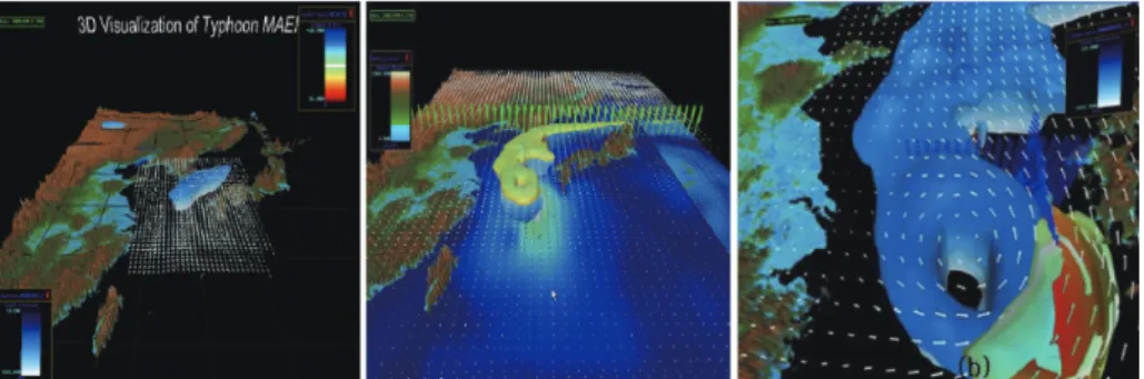
The paper by Kim et al. (“Scientific Visualization of Time-varying Oceanographic and Meteorological Data Using VR”) presents an oceanographic- and meteorological-data visualization method based on the virtual-reality technology (Fig. 2) by showing the three-day oceanographic- and meteorological- simulation results for the formation and track of Typhoon Maemi in 3D , which hit Korea in 2003 (Kim et al., 2005).
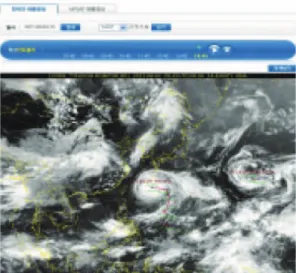
Korea Meteorological Administration (KMA) provides general weather forecasts, and when a typhoon comes, it shows the updated typhoon track and influence radius estimated in three-hour intervals (Fig. 3), and forecasts the influence range of the typhoon for each municipal and provincial area (Kim et al., 2008).
Fig. 2. Scientific visualization of Typhoon Maemi(C.S. Kim et al., 2005).
Satellite data are being visualized on the virtual globes all over the world. Most of the visualization techniques employed, however, merely involve the overlaying of 2D satellite images. The need for displaying various meteorological and climate change date including the digital-model, ground observation, and satellite image data in 3D on digital globes is increasing and the technology that provides 3D visualization must be developed.
3. Design of 3D Visualization Techniques
In this chapter, the design concept and technique for visualizing the COMS data is presented. The
system that was proposed in the Spring Conference of Korea Information Processing Society (May 2011), was expanded to include the processing of the COMS data “Climate Change Visualization Service Design”
(Kim et al., 2011). This chapter describes the system structure, platform structure, system flow, and data processing algorithm.
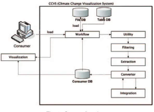
1) System structure
Fig. 4 shows the system structure for the visualization of the COMS data on the virtual globes.
The data that are visualized are satellite data, but these can be expanded to include the digital-model and ground observation data, including yellow dust and wind field. If the service for the visualization of the COMS data is requested, the service control module will define the service for the requested data and will perform the geoprocessing procedure via data conversion, superposition, and analysis. The Keyhole markup language (KML) is created via geoprocessing, and it is visualized on the virtual globes.
2) Platform structure
The platform of this system has seven stages, as shown in Fig. 5. Several server nodes and CentOS compose the hardware and system software. The server nodes were configured to manage and process large-volume files, and CentOS was used for real-
Fig. 3. Typhoon image provided by KMA.Fig. 4. System structure.
time resource monitoring, clustering, etc. The software was developed using the UCAR library, the HDF (Hierarchical Data Format) library, and the system software stack.
The middleware service consisted of workflow, geocoding, data integration, data conversion, data filtering, and visualization & mapping. The application had the function of visualizing the data in graphs, vectors, symbols, polygons, and 3D. Through the geoprocessing of the middleware, the KML, flash, video clip, and image file were created from the data, and they are visualized on the virtual globes.
3) System flow
Fig. 6 shows the system flowchart. The system consists of the client and the server. The client is the user interface for visualization, and the server has the preprocessing function for creating the visualization file.
If the user requests the visualization service, the service for the relevant data is defined in the workflow. According to the contents of the defined service, the applicable utilities and preprocessing functions are activated. After the user applies the activated utilities and preprocessing, a KML is created as the visualization file via the KML converter. The created logs and files are stored in the
database. The KMLs for diverse meteorological phenomena are stored in the server. Several KMLs for the same time zone can be combined to create secondary KMLs, and the combined secondary KMLs can have the effect of superposed visualization.
4) Data processing
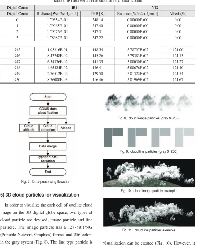
The data of Typhoon No. 9, Muifa, in 2011 (July 28-September 9) are as follows (in the HDF5 data format). Among the five channels, the IR1 and VIS channels were used, as shown in Table 1.
Using the data-processing module that was developed with the HDF library, the cloud top height and cloud condition were extracted using the brightness temperature (TBB) of the IR1 channel.
The albedo of the VIS channel was also extracted.
The current algorithm was not used to detect clouds and cloud top height estimation, and IR1’s TBB value below a dew point (an absolute temperature of 273) was considered a cloud. Cloud top height estimation was calculated by assuming the lowest height from 3Km to the highest height at 13Km. The typhoon KML data were created by integrating the three extracted data and cloud particle images. The latitude and longitude of the data in each grid were created via preprocessing, with the center of the Chollian satellite image (0°latitude and 128.2°
longitude) as the reference (Fig. 7).
Fig. 5. Platform structure.
Fig. 6. System flowchart.
5) 3D cloud particles for visualization
In order to visualize the each cell of satellite cloud image on the 3D digital globe space, two types of cloud particle are devised, image particle and line particle. The image particle has a 128-bit PNG (Portable Network Graphics) format and 256 colors in the gray system (Fig. 8). The line type particle is composed of horizontal and vertical lines (Fig 9).
Both of two types of cloud particles have gray value between 0 and 255.
If the image particle is used, more realistic clouds
visualization can be created (Fig. 10). However, it takes up a lot of system resources and thus makes it difficult to simulate a smooth moving cloud. The line particle method rather lacks of realistic representation, but takes up less resources and enables the movement
Table 1. IR1 and VIS channel values of the Chollian satelliteDigital Count IR1 VIS
Digital Count Radiance[W/m2sr-1mm-1] TBB [K] Radiance[W/m2sr-1mm-1] Albedo[%]
0 1.79554E+01 348.14 0.00000E+00 0.00
1 1.79365E+01 347.40 0.00000E+00 0.00
2 1.79176E+01 347.31 0.00000E+00 0.00
3 1.78987E+01 347.22 0.00000E+00 0.00
…
945 1.03216E-01 148.54 5.78737E+02 121.00
946 8.43248E-02 145.26 5.79383E+02 121.13
947 6.54336E-02 141.35 5.80030E+02 121.27
948 4.65424E-02 136.41 5.80676E+02 121.40
949 2.76512E-02 129.50 5.81322E+02 121.54
950 8.76000E-03 116.46 5.81969E+02 121.67
Digital Count IR1 VIS
Digital Count Radiance[W/m2sr-1mm-1] TBB [K] Radiance[W/m2sr-1mm-1] Albedo[%]
Fig. 7. Data-processing flowchart.
Fig. 8. cloud image particles (gray 0~255).
Fig. 9. cloud line particles (gray 0~255).
Fig. 10. cloud image particle example.
Fig. 11. cloud line particles example.
of clouds in the simulation more smooth and efficient (Fig. 11). Depending on the intended use, the form of a cloud of particles can be selected
4. Result Images
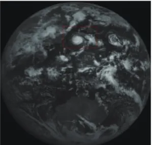
Fig. 12 shows the full-disc image of the Chollian satellite at 14:15, September 4, 2011. The cloud top height, cloud latitude and longitude, and cloud detection data were created from the IR1 and VIS channel values of the image data.
By converting the calculated data into KML data using the proposed system, typhoon images were created (Fig. 13). By mapping the cloud particle VIS value, 3D typhoon images were created (Fig. 14).
Chollian satellite data are 2D data without an altitude value. Through a technique suggested in this study, we were able to run a simulation on the moving video of a three-dimensional typhoon by a 15-minute interval on Google Earth by applying an altitude to the satellite video’s cloud particle.
5. Conclusion and Future Research
The development and launching of the Chollian satellite is meaningful in many ways. In terms of meteorological observation, Korea had been depending on Japanese satellite data, but it eventually became the world’s seventh country that owns a meteorological satellite, making quick and accurate weather forecasts possible. Meanwhile, studies on the use of the Chollian satellite data must be conducted.
Visualization techniques are being studied worldwide for the efficient analysis of satellite
Fig. 12. Chollian satellite image.Fig. 13. Typhoon image before the addition of the cloud particles VIS value.
Fig. 14. Typhoon image after the addition of the cloud particles VIS value.