Anomaly Detection in Sensor Data
Jong-Min Kim
1․Jaiwook Baik
2†1
Statistics Discipline, Division of Science and Mathematics, University of Minnesota at Morris, U.S.A
2
Department of Information Statistics, Korea National Open University, Seoul, Republic of Korea
Purpose: The purpose of this study is to set up an anomaly detection criteria for sensor data coming from a motorcycle.
Methods: Five sensor values for accelerator pedal, engine rpm, transmission rpm, gear and speed are obtained every 0.02 second from a motorcycle. Exploratory data analysis is used to find any pattern in the data. Traditional process control methods such as X control chart and time series models are fitted to find any anomaly behavior in the data. Finally unsupervised learning algorithm such as k-means clustering is used to find any anomaly spot in the sensor data.
Results: According to exploratory data analysis, the distribution of accelerator pedal sensor values is very much skewed to the left. The motorcycle seemed to have been driven in a city at speed less than 45 kilometers per hour. Traditional process control charts such as X control chart fail due to severe autocorrelation in each sensor data. However, ARIMA model found three abnormal points where they are beyond 2 sigma limits in the control chart. We applied a copula based Markov chain to perform statistical process control for correlated observations. Copula based Markov model found anomaly behavior in the similar places as ARIMA model. In an unsupervised learning algorithm, large sensor values get subdivided into two, three, and four disjoint regions. So extreme sensor values are the ones that need to be tracked down for any sign of anomaly behavior in the sensor values.
Conclusion: Exploratory data analysis is useful to find any pattern in the sensor data. Process control chart using ARIMA and Joe’s copula based Markov model also give warnings near similar places in the data. Unsupervised learning algorithm shows us that the extreme sensor values are the ones that need to be tracked down for any sign of anomaly behavior.
1)
Keywords: Sensor Data, Exploratory Data Analysis, Control Chart, ARIMA Model, Unsupervised Learning Algorithm
1. Introduction
Sensors are becoming popular in everyday life tasks as the era of Internet of Things (IoT) has lately arrived.
The IoT will include 26 billion units installed by 2020 [28]. Future of IoT seems to expect each object in hu- man life will be equipped with sensors which communi- cate each other to enable human life easier than before
[6]. Sensors are deployed to monitor a phenomenon or to control a process [1]. They are used in diverse appli- cations domains including business applications such as sales growth, industrial applications such as quality and reliability control of product, military applications such as enemy surveillance, and personal applications such as health monitoring [5].
Massive volume of IoT data generated by sensors is
†Corresponding Author [email protected]
Received October 12, 2017; revision received January 8, 2018; Accepted: January 9, 2018.
extremely dynamic, heterogeneous and imperfect [12]. It requires real-time analysis and decision making. One of the major goals of IoT systems is automatic monitoring and detection of abnormal events, changes or drift [13].
Traditionally anomaly detection had been carried out manually with the data visualization ([30]). But it is a burden on the operator. A survey is provided [13, 31, 34].
Wireless medical sensors collect various physiological parameter such as heart rate, pulse, oxygen saturation, Respiration and blood pressure. These sensors are at- tached to the subject’s body and continuously monitored in hospital or home. Various sensor anomaly detection systems in medical sensors have been proposed and ap- plied to date [37, 17, 20] .
Recently automated statistical and machine learning approaches such as minimum volume ellipsoid [35], convex pealing [35], nearest neighbor [33], clustering [8], neural network classifier [24], support vector ma- chine classifier [9], and decision tree [23] have been employed. These methods are faster than manual ap- proach but they are not suitable for real-time anomaly detection in streaming data. Real-time anomaly de- tection method has been employed in streaming environ- mental sensor data where incremental data-driven autor- egressive model for the data was fitted and a prediction interval is calculated in order to identify streaming data anomalies [22].
A generic analytics engine is described [2] where sen- sor data that has been transmitted through cloud infra- structure is checked for stationarity and non-periodicity, and then nonparametric anomaly and change detection methods such as generalized Kolmogorov Smirnov test [18], bootstrapping based change detection [14] and one-class SVM are used to detect the abnormal behaviors.
Capturing all anomalies is impossible, which is the reason why anomaly detection methods are used in un- supervised setting [11]. But when there is a labelled re- sponse regression can be used to find relationship be- tween a set of predictors and a response variable [3, 25].
There are other predictive models available. Kalman fil- ter is a recursive filter that approximates the state of a system based on noisy measurements. Dynamic Baysian
Networks can be seen as generalized Kalman filters or generalized hidden Markov models [22]. Artificial neu- ral networks can be used to predict time series using his- torical data. Such networks can capture non-linear rela- tionships and can be used for predicting financial time series [10].
In time series, a number of regression models such as Autoregressive (AR) [4], Autoregressive Moving Average (ARMA) [30], and Autoregressive Integrated Moving Average (ARIMA) [29] are applied to detect anomaly in the series. Sensor value from historic values is predicted using the spatiotemporal correlation that exists among physiological parameters and compared with the actual sensor value, where the difference is compared against a threshold value, which is dynamically adjusted [19].
However, models using external predictors such as ARX, ARMAS have not been thoroughly investigated in the literature.
Machine learning approaches are the Naïve Bayes, Bayesian network and decision tree methods [7]. Clustering method such as K nearest neighbor (K-NN) is also used.
Mahalanobis Distance (MD) between predicted and ac- tual multivariate instances is used to detect sensor anom- aly [26]. With the arrival of a new instance MD is calcu- lated between the training data in the sliding window and the current physiological parameter values. If MD is greater than the degree of freedom, abnormal physio- logical parameters are identified, and the window slides one slot by removing the oldest first instance and adding the new one.
Another sensor fault detection system for wireless sensor network is to utilize piecewise linear models of time series. Linear SVM is used to detect abnormal in- stances and linear regression is used for prediction purposes. Linear regression is a statistical modeling method used to predict the current value of the moni- tored parameters. One drawback to linear regression is that it is not an efficient prediction tool for application where the physiological parameters have rapid trend change.
Modeling serial dependence in time series is an im-
portant step in statistical process control. Fully auto-
Fig. 1 Time series plot of the raw data mated routines for obtaining maximum likelihood esti-
mates for given time series data and then drawing a Shewhart-type control chart have been proposed [27].
The routine is available as “Copula.Markov” package in R [15]. It has been pointed out that Joe's copula para- metric maximum likelihood method provides the most reliable estimates of the UCL and LCL compared to the other copula methods. So we employed Joe’s copula to find any anomaly behavioral points in the sensor data.
Motorcycle is no exception to have a lot of sensor data. In this paper, we are looking for anomaly behavior in the motorcycle sensor data. Namely sensor values of accelerator pedal, engine rpm, transmission rpm, gear and speed are gathered every 20 millisecond for a total of about 39 minutes and examined for any anomaly behavior. In section 2, exploratory data analysis is tried for the sensor data in order to find any pattern or any correlations in the sensor data. In section 3, control charts for independent and correlated data are tried to find out-of-control points in the sensor data. Out-of-con- trol points are interpreted as anomaly behavioral points in this section. Joe copula is tried to find any anomaly behavioral points. In section 4 unsupervised learning al- gorithm such as k-means is tried to find clusters among the sensor data. Lastly conclusions and some discussions are given in section 5. Readers must be warned that the results presented here had to be transformed in order to
preserve the sensitive details of the data.
2. Exploratory Data Analysis
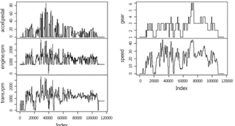
Every 20 millisecond sensor values of accelerator pedal, engine rpm, transmission rpm, gear and speed are obtained for a total of about 39 minutes. We want to find any anomalous behavior in the data. <Fig. 1> shows the time series plot of the raw data. In order to fine the trend in the data we can get an average of raw data for each of every second. <Fig. 2> gives the graph for secondly average accelerator pedal sensor values. As expected,
<Fig. 2> gives more smooth representation of the accel- erator pedal data. But since we want to find the anom- alous behavior in the data we may as well use the origi- nal raw data in <Fig. 1>. So we will dwell on the origi- nal 20 millisecond sensor values in this paper.
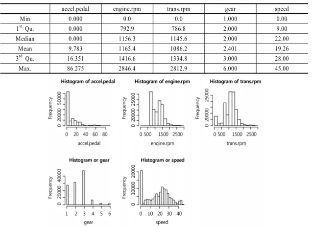
Summary statistics are shown in <Table 1>. Acce-
lerator pedal sensor has a mean of 9.783 while the me-
dian 0. The distribution of accelerator pedal sensor val-
ues is very much skewed to the left which resembles ex-
ponential distribution as shown in <Fig. 3>. Next, en-
gine rpm sensor has similar mean and median values of
about 1,160. According to <Fig. 1> and <Fig. 3>, most
of the engine rpm sensor values are above 780 except at
around time 40,000. It seems to us that the motorcycle
accel.pedal engine.rpm trans.rpm gear speed
Min 0.000 0.0 0.0 1.000 0.00
1
stQu. 0.000 792.9 786.8 2.000 9.00
Median 0.000 1156.3 1145.6 2.000 22.00
Mean 9.783 1165.4 1086.2 2.401 19.26
3
rdQu. 16.351 1416.6 1334.8 3.000 28.00
Max. 86.275 2846.4 2812.9 6.000 45.00
Table 1 Summary statistics of the raw data
Fig. 2 Secondly average time series plot of accelerator pedal sensor data
Fig. 3 Histogram of the 5 variables had been turned off during that time since both accel-
erator pedal and speed sensor values are 0. Next, trans- mission sensor has mean and median of 1086.2 and
1145.6. Next, gear sensor has mean and median values
of 2.401 and 2. According to <Fig. 3>, the motorcycle
had been at low gears of 1, 2 and 3 most of the time.
accel.pedal engine.rpm trans.rpm gear speed
accel.pedal 1.0000 0.6477 0.4638 0.0979 0.2676
engine.rpm 0.6477 1.0000 0.8195 0.1894 0.5582
trans.rpm 0.4638 0.8195 1.0000 0.4058 0.7342
gear 0.0979 0.1894 0.4058 1.0000 0.8537
speed 0.2676 0.5582 0.7342 0.8537 1.0000
Table 2 Correlation structure among 5 variables
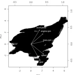
Fig. 4 Graph of the correlations between the two variables Finally speed sensor has mean and median values of
19.26 and 22 respectively. <Fig. 3> shows that the mo- torcycle had been driven in city at speed less than 45 kilometers per hour.
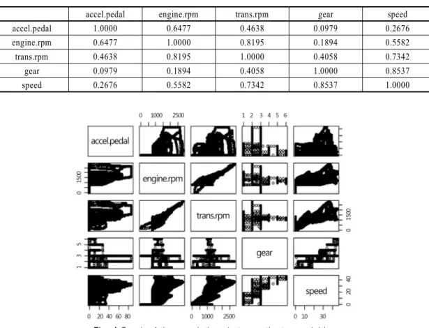
It is interesting to see the correlations among the 5 variables since some of them are presumably correlated.
<Table 2> gives the correlation between the variables while <Fig. 4> shows the graph of the correlation be- tween the variables. For instance the correlation between gear and speed sensor values is as high as 0.85. It is ob- vious that the high value of gear means that the motor- cycle is driving fast, which is reflected in the speed sen- sor gauge. Included in the high correlation values of 0.5 or above are between engine rpm and transmission rpm, between transmission rpm and speed, between accel- erator pedal and engine rpm, and lastly between engine rpm and speed.
However, the correlations in <Table 2> are the correla-
tions for each of the two variables measured at the same
time. But as a driver if you drive a motorcycle you first start
the engine, and then the engine sensor value goes up to 788
from 0 and the gear is at 1 even though accelerator, trans-
mission rpm and speed sensor values are all 0. After sev-
eral seconds of idling you press the accelerator pedal (and
accelerator pedal sensor value goes up), and then in a split
second the press of the accelerator pedal is transmitted to
the engine (and the engine sensor value goes up), and then
in another split second the power is transmitted to the
transmission (and the transmission rpm value goes up),
and then finally in another split second the motorcycle
speeds up (and the speed sensor value goes up). So it may
be interesting to know the correlations between one varia-
ble and another variable with time lags. But we will not
pursue on this issue here.
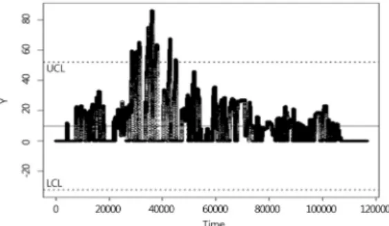
Fig. 5 X control chart for original accelerator pedal sensor data
Fig. 6 X control chart of accelerator pedal for the residual from the ARIMA (5, 1, 3) model
3. Control Charts
We can treat anomaly detection as if we find any in- teresting points in a process. Control charts come in han- dy when controlling a process. So we’d like to plot the raw sensor data with center line and upper and lower control limits. Since it is not reasonable to form a homo- geneous subgroup in this raw data we try individual X chart for each variable, for instance for accelerator pedal.
Even though the raw data are highly correlated over time we treat them as if they are independent and draw X chart for accelerator pedal sensor values in <Fig. 5>. But since there is high correlation between adjacent sensor values the control limits based on the variability between adjacent sensor values does not fully reflect the process variability, thereby both lower control limit (9.709587) and upper control limit (9.857119) are very close to- gether, which gives too many out-of-control warnings throughout almost all the period. We can see that there are 116116 out-of-control warnings from the total of 116593 points and that there are 115915 violating runs.
The reason we have so many violating runs is because we have serially highly correlated sensor values.
It is very common that the serially observed sensor data are highly correlated, and some of them are not
even stationary. If they are not stationary differenced series may yield the stationarity. Serially correlated data may be modelled through autoregressive and moving average (ARMA) model. Then the white noise which is the residual from the ARIMA model is used to produce X control chart to see where the abnormal pattern occurs. We apply the above procedure to accelerator pedal sensor values. It turned out that the appropriate model for the accelerator pedal sensor values is ARIMA (5, 1, 3). Hence, if we let be the original accelerator pedal sensor value at time and be the differenced sensor value, that is
, then the appropriate ARIMA model turns out to be the following.
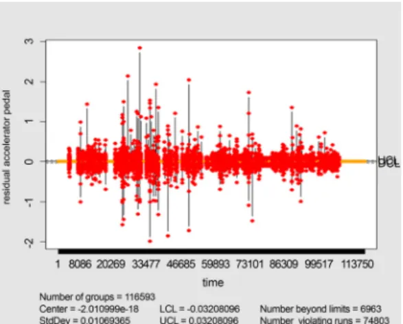
X control chart for the residual from the ARIMA (5,
1, 3) model is shown in <Fig. 6>. We can see that the
upper and lower control limits are 0.032080967 and
-0.0328096 respectively. It is obvious that the control
limits are very close to center line since we have a very
large number of observations, specifically 116593 to be-
gin with. This time, however, there are only 6963 out-of-
control warnings out of the total of 116593 points. This
number is far less than 116116 which we had when we
do not consider ARIMA model. But there are still too
Fig. 7 Control chart by using Joe’s copula to the accelerator pedal data
many out-of-control warnings. So it would be helpful to see what abnormal events have happened for the cases where the residuals are above 2 in <Fig. 6>. Those cases were at times 26547, 30990 and 49704.
Copulas have been a popular method both for defining multivariate distributions and for modeling multivariate data [36] in the areas of actuarial science, bioinformatics, biostatistics and finance because a copula function does not require a normal distribution and independent, iden- tical distribution assumptions. Furthermore, the in- variance property of copula has been attractive in the fi- nance area. A copula characterizes the dependence be- tween the components of a multivariate distribution;
they can be combined with any set of univariate margin- al distributions to form a full joint distribution. A copula is a multivariate cumulative distribution function (CDF) whose univariate marginal distributions are all Uniform (0, 1). Suppose that
⋯
has a multivariate CDF with continuous marginal univariate CDFs
⋯
. Then each of
⋯
is dis- tributed according to Uniform (0, 1). Therefore the CDF of
⋯
is a copula. This CDF is called the copula of and denoted by
.
contains all information about dependencies among the compo- nents of but has no information about the marginal CDFs of . All -dimensional copula functions have domain
and range .
There are various types of copulas. One simple copula is independence copula. Multivariate normal and multi- variate -distributions offer a convenient way to gen- erate families of copulas. In this paper we consider an Archimedean copula with the strict generator of the form below
⋯
⋯
where the generator function satisfies the following 1) is a continuous, strictly decreasing, and convex
function mapping onto ∞
2) ∞ 3)
There are several Archimedean copulas such as Frank copula, Gumbel copula and Joe copula. It’s been pointed out that Joe’s copula parametric maximum like- lihood method provides the most reliable estimates of the UCL and LCL compared to the other copula methods. So we used Joe copula which has the gen- erator
, ≥ . It turns out that is 2 for the accelerator pedal data. The esti- mates of the process mean and standard deviation are 9.783353 and 14.097014 respectively for our data.
Therefore, the upper and lower control limits are
× and
× . <Fig. 7> is the control chart after we fit Joe copula to our data. There are 3546 out-of-control warnings out of the total of 116593 points. This number is smaller than 6963 which we had when we considered ARIMA model. Out-of-control warning were at times 28549 to 28835, 30267 to 30420, 31033 to 36223, 37231 to 38077, 42480 to 42957, and 44899 to 45051. These out-of-control warning points do not exactly coincide with the warning points in ARIMA model but they are all close to each other.
In this section we tried univariate approach to accel- erator pedal only. So it would be more appropriate to try multivariate approach to the data. We tried Hotelling’s
statistic to the data and came up with multivariate
chart. But it was naïve to assume that we have in-
dependent observations. Multivariate time series analy-
sis is desired where the concepts of cross correlation and
transfer function models are used to characterize the
original sensor data.
PC1 PC2 PC3 PC4 PC5
accel.pedal 0.3451 0.5363 -0.7380 -0.1982 -0.0966
engine.rpm 0.4780 0.3899 0.2901 0.6934 0.2337
trans.rpm 0.5140 0.1075 0.4755 -0.6788 0.1932
gear 0.3664 -0.6313 -0.3803 0.0715 0.5634
speed 0.5039 -0.3877 0.0219 0.1185 -0.7624
Table 3 The result from the PCA applied to our data
4. Unsupervised Learning
Unsupervised learning is a type of machine learning algorithm used to draw inferences from dataset consist- ing of input data without labeled responses. In our data, we have 5 sensor values, specifically sensor values of accelerator pedal, engine rpm, transmission rpm, gear and speed every 20 millisecond. We do not know wheth- er the data at each time point is abnormal or not. So we can treat the data as if we are in an unsupervised learn- ing environment. The most common unsupervised learn- ing method is cluster analysis, which is used for ex- ploratory data analysis to find hidden patterns or group- ing in data. The clusters are modeled using a measure of similarity which is defined upon metrics such as Euclidean or probabilistic distance.
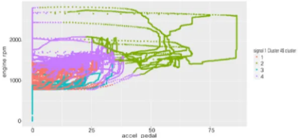
Common clustering algorithms are hierarchical cluster- ing, k-means clustering, Gaussian mixture models, self-or- ganizing maps, and hidden Markov models. Unsupervised learning methods are used in bioinformatics for sequence analysis and genetic clustering, in data mining for se- quence and pattern mining, in medical image segmenta- tion, and in computer vision for object recognition. In this paper, k-means clustering is tried for our data.
But before we try k-means clustering we try principal component analysis (PCA) to reduce our 5 dimensional data to a lower dimension to reveal the sometimes hidden, simplified dynamics that often underlie it. PCA is a stat- istical procedure that uses an orthogonal transformation to convert a set of observations of possibly correlated varia- bles in a set of values of linearly uncorrelated variables called principal components. The number of principal components is less than or equal to the smaller of the num- ber of original variables or the number of observations.
The result from the PCA is shown in <Table 3>.
Hence, if we let
be the
observation ⋯
of the
variable then the first principal component can be written as in the follow- ing equation, which resembles the overall mean or over- all speed since high values of acceleration pedal, engine rpm, transmission rpm, gear and speed mean that the motorcycle is in overall high speed.