Corresponding author: Lee Misuk, Tel.+82-62-530-1345, Fax.+82-62-530-1349 E-mail: [email protected]
This research was presented at the 2014 Fall Conference of The Korean Society of Fashion Business.
This research was supported in 2014 by the MOE (The Ministry of Education), Republic of Korea, under the BK21 plus project (S13HR15D0801) supervised by the NRF(National Research Foundation of Korea).
A Study on Fashion Collections Colors in Korea, China, and Japan:
Focused on Comparison with Trend Colors by Carlin
Hong Hyungmin · Lee Misuk⁺
Dept. of Clothing & Textiles, Chonnam National University Dept. of Clothing & Textiles, Chonnam National University, Human Ecology Research Institute, Chonnam National University ⁺
Abstract
The purpose of this study is to analyze women apparel's colors in the Seoul, Beijing, and Tokyo collections and examine the color characteristics of three collections through comparison with trend colors suggested by Carlin, a color forecasting group. A literature review and an empirical study were used for methodology. The literature review examined the status and characteristics of the three collections, a fashion color forecast, and F/W 2014-15 trend colors by Carlin based on previous researches and literature data on fashion color. The empirical study extracted and analyzed 2014-15 F/W women's ready-to-wear collections in Seoul, Tokyo, and Beijing and compared the result with trend colors by Carlin. First, the colors of women's apparel were analyzed in the Seoul, Beijing, and Tokyo collections. All three collections commonly used achromatic colors and the percentage of Bk, Gy, Wh, R, and B colors was high. All three collections used achromatic colors frequently for the main color and sub colors. For accent colors, while the application of achromatic colors was high in the Seoul collection, the application of chromatic colors was high in the Tokyo and Beijing collections. Second, women's apparel colors in the Seoul, Beijing, and Tokyo collections were compared with trend colors suggested by Carlin. All three collections highly reflected Bk, Wh, and R (Carlin's forecasting color of 'Splendor') and B (forecasting color of 'Boreal'). However, the reflection of metallic colors suggested as a keyword of 'Brave New World' and Pk color of 'Sensitive' and 'Boreal' were a bit low.
Key words : Asia fashion, color forecasting, fashion collections, trend color
I. Introduction
World leadership is changing with the rapid growth of Asian countries. About the half of world’s population is living in Asia and the six counties among world’s ten large scale countries belong to Asia (Bill, 2008/2010). International Monetary Fund (IMF, 2013) reported, in their 2013-2014 GDP rankings, China is ranked 2nd, Japan is ranked 3rd, India is ranked 11th and Korea is ranked 15th, which shows the competitiveness of Asian countries. Korea formed Hallyu(Korean wave) as Korean pop culture gained a lot of popularity in East Asia in early 2000s (J. Lee, 2013). As Hallyu(Korean wave) propagated to the whole Asia, in substance, it caused enormous economic effect in indirect market including tourism, communication, fashion industry and etc. and became a trend affecting across the cultural industry (Han, 2005). The Hallyu(Korean wave) which was limited to Asia with TV drama expanded to North America and Europe as its spreading media was changed to K-Pop and Psy’s ‘Gangnam Style' played a key role in introducing Korean pop culture to all over the world by gaining huge popularity. China is not only playing a role as a economical/political hub of Asia after experienced financial crisis, but also rising as a major axis for global economic order (C. Lee, 2010). Japan joined the group of developed country with the rapid economic growth in 1970s and has established its solid foothold not only in the area of economy, but also in the area of fashion as many designers debuted at the ‘big four’ fashion collections.
Starting with Issey Miyake, Yohji Yamamoto, Rei Kawakubo and etc., Japanese settled down as one of main streams in global fashion industry showing Japanism which is their unique
aesthetic (Jung, 2012) and Tokyo collection which is recognized as one of five major collection is showing big impact.
Referring David, in the post capitalism environment, as world’s economy is globalized, clothing industry is becoming more closely related to politics, economy, and capital (as cited in Koh, 2011). From this view point, Korea, China and Japan who are growing their influence in global will lead a trend in fashion before long. Therefore, it is time to research collections in these East Asian countries as well as the ‘big four’ collection which can be called as hub of high fashion.
Color is one of the most important design factors for people to buy clothes. That is. color is the key of design and marketing tool, so a color plan is done in very elaborate way.
Fashion color is related to trend color considering environment, culture and social mood. The trend color and color preference can be different by the identity of region, nation and nationality and cultural back ground. That is, each country has its own association of trend color (Koh & Lee, 2013). At fashion planning, a fashion theme suggesting the direction of design is set, a color theme and a material theme are decided based on the information of domestic color trends and, for last, a silhouette and details are selected. The most influential factor in the expression of the overall fashion theme image is the color which is emotional and instant (Sooyoun Kim, 2001). Therefore the color is most elementary and essential among fashion design factors and deeply relate to a trend.
In fashion collection, various researches for color and trends have been conducted. No research has been conducted for colors used in Korea, China and Japan collections or their comparison with trend color from fashion
forecasting agency while studies for the color characteristic in world major 4 collections (Koh
& Lee, 2013) and fashion trend in overseas collections and domestic collections in 1990s (Park, 2000). Therefore, the purpose of this study is to analyze color used in 2014-15 F/W women's ready-to-wear collections in Seoul, Beijing and Tokyo which are major Asian fashion cities and identify the color characteristics of women’s apparel in the three countries by the comparison with the color trend of Carlin which is world renowned color forecasting agency.
With this, not only by looking up color trend of Korea, China and Japan collection, but also, by comparing growing fashion markets in China and Japan collections which are recognized as one of the five major collections, the result of this study is expected to be utilized as preliminary data guiding the direction of the color plan of Korea.
This study was mainly conducted for Seoul, Beijing and Tokyo collections which are held in the three major cities of the three countries and was composed of literature review and empirical study. In the literature review, fashion collection status, color prediction and trend color forecasted by Carlin of Korea, China, and Japan based on preliminary studies on fashion and literature data. In empirical study, color characteristics extracted from 2014-15 F/W women’s apparel in Seoul, Beijing, and Tokyo collections and this was compared to 2014-15 F/W trend color suggested by Carlin to look up how much the trend color was reflected. Carlin was chosen since it not only suggests a trend cross the industry but also it cooperates with globally renowned fashion brands including LVMH, L’oreal, Dior, Hugo boss, H&M and etc (“Carlin”, 2014).
II. Theoretical Background
1. Status of Korea, China, and Japan Fashion Collection
The first fashion show was held in Chosun Hotel by Madam Norano in 1954 but had been prohibited by reason of encouraging extravagance until 1990s when periodic collection started to be held not only in Seoul, but also in many other local metropolitan areas.
The development of domestic collection could be achieved by persistent effort of SFAA, KFDA, NWS which are representative collections of Seoul (Soomin Kim, 2008). SFAA collection is the first periodic collection in Korea which is held every year since 1991. In 1992, New Wave in Seoul was organized by young designers with capital and marketing capabilities (Ha, 2014).
Seoul city has held a unified collection and presented a fashion trend of the next season twice every year(March/April and October) by gathering designers who carries out each collection since November 2004 when it aimed at ‘the cultivation of one of the world’s five major collections’ (Soomin Kim, 2008).
One the other hand, in China, a fashion collection was first held in Beijing on December 5, 1997 by designers. Since 1998, a formal name of ‘China Fashion Week (时装周)’ has been used. 1997 to 1999 was the beginning period of ‘China Fashion Week’ when a fashion and a business were combined and grew. Since China's admission to WTO, a business structure and social transformation have entered the transition period and ‘China Fashion Week’ has been developed as a professional fashion event (“China Fashion Week”, 2008). Now China Fashion Week is the biggest collection with Shanghai collection in China. It is held two
times a year in March and October and other small to big exhibitions and forums are held together. Form 2011, it has cooperated strategically with Mercedes Benz who is supporting New York collection, which is one of the four major collections, Tokyo, and Berlin Fashion week(“China Fashion Week”, 2014), and it expanded its scale by China Fashion Week Organization Committee for the ‘cultivation of Chinese brands and designers’ (H. Kim, 2013).
At last, in Japan, a term of 'fashion show' was first used in a Kimono show by actresses held in Mitsukoshi Department Store in 1927.
The Tokyo Collection started in 1985 by the Council of Fashion Designers (CFD) of Tokyo which was founded by 23 representative Japanese designers (“Japan fashion collection”, 2013). Since 2006, a general fashion event of 'JWF (Japan Fashion Week)' has been held by JFWO (Japan Fashion Week Organization) under slogans of the gateway of success for new designers, a starting point of cooperation among designers, manufacturers, and fashion retailers, and making Tokyo a happy and fashionable city (“Tokyo Fashion Week”, 2014). Tokyo collection of Japan is held two times a year in March and October under the supervision of JFW (Japan Fashion Week). It started with three slogans:
Gateway of new designers, departure of cooperation among designer, manufacturer and apparel retailer, and make Tokyo joyful and fashionable. In present, Tokyo collection is recognized as one of five major collections along with Paris, Milano, New York, and London ("Tokyo Fashion Week", 2012).
2. Color Forecast and 2014-15 F/W Trend Color
A fashion trend is basically presented with
elements of fashion theme, fashion image, color, material, silhouette, item, detail and etc. Among these elements of a fashion trend, a color trend is presented at first (Sooyoun Kim, 2001). The color trend used in fashion, i.e. fashion color is used interchangeably for two meanings: One is fashion forecasting color which is forecasted or suggested to become a trend in near/far future.
The other is currently popular color which many people choose and use. Generally, fashion color means the latter, while it means the former with fashion color information forecast (Jang, 1998).
Color forecast is carried out 18-24 months before the sale season by a color forecasting agency. Color forecasters discuss issues which can cause social changes including art, sports, politics, economic trend, international events, and etc., detect small to big changes in consumer life style and preference through observation and investigation, and trace a emerging trend in present and future (Kate &
Debra, 2012). Through this process, fashion color is suggested two times a year by the International Commission for Fashion and Textile Color (Intercolor) mainly organized with countries in Europe. The forecasting fashion color is presented as a concept theme presenting overall image as well as a color palette with a characteristic image related to a theme (Y. Kim, H. Lee, & Y. Lee, 1999). The forecasting color suggested is displayed through color or fabric exhibition like Interstoff or Première Vision or transmitted to designers, brands, and retailers through commercial sale.
In this day, major color forecasting agencies are Inter-Color and PANTONE VIEW Colour Planner which were established by the lead of France, Swiss, and Japan, and Carlin, Promostly, and Nellyrodi which are trend information companies in France. They are companies with
about 50-year career of providing experienced forecast and analysis. Carlin chosen by this study for color comparison is a trend/marketing information company established in France in 1947 and has information network covering 25 regions of Europe, North America, and Asia. It provides color trend as well as other trends across the industry including interior, fashion, beauty, electronics, automobile, and etc. They are now cooperating with world renowned companies including LVMH, L’oreal, Dior, SHISEIDO, CLARINS, Hugo boss, H&M, SWATCH, NIKE, and etc. (“Carlin”, 2014). On the other hand, the advent of internet in 21st century changed color prediction and trend development rapidly and this change caused the advent of web based in formation service companies (e.g. WGSN, Style sight, Trend pulse, Trend zine, Fashion Snoops). These companies are based on internet space, analyze real-time consumer investigation and trend, and provide information about exhibitions and retail business (Kate & Debra, 2012).
2014-15 F/W Trend Color by Carlin suggests with four keywords: ‘Brave New World’, ‘Boreal’, Splendor’, and ‘Sensitive’(“Carlin trend color”, 2014). The first keyword ‘Brave New
Figure 1.
Cariln 2014-15 Trend Color Keyword 'Brave New World'
- http://www.ktnews.com/htm/view.asp?idx=922&
GotoPage=1
Figure 2.
Cariln 2014-15 Trend Color Keyword 'Boreal'
- http://www.ktnews.com/htm/view.asp?idx=
922&GotoPage=1
World’ means fusion of techno and sensible adventure. The keyword searching for the fusion of scientific innovation and sensible contents suggests metallic color with earthy tone and gray tone and another metallic color with delicate gloss inspired from asphalt (Figure 1).
The second keyword ‘Boreal’ means simplicity, comfort, and shining happiness under the trace of well-being from affection and tenderness.
Inspired by Scandinavia which is a well-being region, the keyword expresses unique and detailed color of aurora and suggests purple blue and stellar pink mainly with cold color (Figure 2). The third keyword ‘Splendor’ means the perfect balance of exaggeration and minimalism. The keyword inspired by Renaissance and splendor of the past presents ideal proportion and balance by adding a little modernity to the inspiration of Renaissance and suggests dusty white, orange, red and black (Figure 3). The forth keyword ‘Sensitive’ means urban romanticism. The keyword presents complexity of emotion which is floating around freely, ambiguous and disordered and suggests pink reminds detailed emotion and flushed skin as a trend color (Figure 4).
Figure 3.
Cariln 2014-15 Trend Color Keyword 'Splendor'
- http://www.ktnews.com/htm/view.asp?idx=919
&GotoPage=1
Figure 4.
Cariln 2014-15 Trend Color Keyword 'Sensitive'
- http://www.ktnews.com/htm/view.asp?idx=919
&GotoPage=1
Table 1. 2014-15 F/WTrend Color of Carlin
Keyword Brave New World Boreal Splendor Sensitive
Trend Color
Gold : Metal glossy vivid yellow, strong yellow, moderate yellow, dark yellow,
light olive brown Silver : Metal glossy
medium gray
Purple-blue, stella pink
Dusty-white, orange-red,
Black
Pink
2014-15 F/W Trend Color suggested by Carlin can be summarized into metallic color, purple, blue, white, orange, red, black, pink, and etc.
as shown in Table 1.
III. Scope of Research and Method
The scope of the study was limited to 2014-15 F/W women’s ready-to-wear collections in Seoul, Beijing, and Tokyo to analyze color characteristics of Korea, China and Japan and compare it with trend color by Carlin.
Research data were collected through online web sites: Vogue Korea (www.style.co.kr/) for Seoul collection, www.chinafashionweek.org/ for Beijing collection, and tokyo- mbfashionweek.com/jp/ for Tokyo collection. The collected images from those web sites were classified by excluding overlapping colors and unmeasurable colors. As a result, 693 colors from 61 brands in Seoul collection, 430 colors from 22 brands, and 942 colors from 34 brands in Tokyo
collection were selected.
To collect color data, color chip and RGB value was extracted by using the Eyedropper Tool of PhotoShop CS6, and then RGB value of each color chip was converted to HV/C value
with Munsell Conversion-Version 12.14.5b. Total 4,450 colors were extracted: 1228 colors from Seoul collection. 877 colors from Beijing collection, and 2,345 colors from Tokyo collection by limiting 4th degree coloration which are visually definable. For the specific grasp of color characteristics, colors were classified into main color which occupies more or equal to 50% (1,770 colors), sub color which occupies more or equal to 10% and less than 50% (1,955 colors) and accent color which occupies less than 10% (717 colors). The converted Munsell values were classified with ISCC-NBS (Inter-Society Color Council-National Bureau of Standards) for color analysis. Base on 13 basic colors of ISCC-NBS which are Pk (pink), R (red), O (orange), Br (brown), Y (yellow), Ol (olive), G (green), B (bule), P (purple), Wh (white), Gr (gray) and Bk (black), Gold and Silver which are metallic colors reflecting Carlin’s trend forecasting color were added for the analysis. As seen in preceding research (Sooyung Kim, 2008), in ISCC-NBS system, metallic colors like metal glossy vivid yellow, strong yellow, moderate yellow, dark yellow and light olive brown were included as Gold and metal glossy medium gray was
Figure 5. 2014-15 F/W Collection Color Ratio
included as Silver. For color characteristic analysis, Gold was included in chromatic color and Silver was included in achromatic color.
IV. Result and Discussion
1. Color Characteristics of Korea, China, and Japan 2014-15 F/W Collection
The analysis results for 4,450 color data extracted from Korea, China and Japan 2014-15 F/W Collection were shown in Figure 5 and Table 2.
In detail, for the color characteristics of the three collection, 55% of colors were achromatic color and 45% of colors were chromatic colors.
The highest shown tone was Bk (25.4%), followed by Gy (14.4%), B (14.3%), Wh (13.8%), R (7.8%), Pk (4.3%), and Br (4.2%).
By collection, achromatic color was 62.2%
and chromatic color was 37.8% in Seoul collection, achromatic color was 50.4% and chromatic color was 49.6% in Beijing collection, and achromatic color was 52.8% and chromatic color was 47.2% in Tokyo collection.
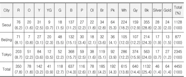
Table 2. 2014-15 F/W Collection Color Frequency (%)
City R O Y YG G B P Ol Br Pk Wh Gy Bk Silver Gold Total
(%)
Seoul 76 (6.2)
20 (1.6)
31 (2.5)
9 (0.7)
18 (1.5)
137 (11.2)
27 (2.2)
22 (1.8)
34 (2.8)
64 (5.3)
224 (18.2)
159 (12.9)
355 (28.8)
28 (2.3)
24 (2.0)
1128 (100)
Beijing 71 (8.1)
7 (0.8)
27 (3.1)
20 (2.3)
48 (5.5)
132 (15.1)
30 (3.4)
18 (2.1)
32 (3.6)
36 (4.1)
105 (12.0)
107 (12.2)
214 (24.3)
17 (1.9)
13 (1.5)
877 (100)
Tokyo 203 (8.7)
51 (2.2)
84 (3.6)
12 (0.5)
52 (2.2)
368 (15.7)
59 (2.5)
38 (1.6)
119 (5.1)
92 (3.9)
286 (12.2)
374 (15.9)
563 (24.0)
17 (0.7)
27 (1.2)
2345 (100)
Total 350 (7.8)
78 (1.8)
142 (3.2)
41 (0.9)
118 (2.7)
637 (14.3)
116 (2.6)
78 (1.8)
185 (4.2)
192 (4.3)
615 (13.8)
640 (14.4)
1132 (25.4)
46 (1.4)
64 (1.4)
4450 (100)
That is, all three collections used achromatic colors commonly and especially, the percentage of Bk, Gy, Wh, R, and B colors was high. It was very similar to colors forecasted by trend information companies such as Carlin, Promostly, and Inter-color. As indicated by Yune and Kim (2004) that with the development of technology and the influence of feminism and subculture, the perception of achromatic colors was changed and its use was increased because of its association of diverse images, such achromatic colors as Bk, Gy, and Wh were commonly used in 2010-11 F/W Paris, Milan, New York, and London Collections (Koh & Lee, 2013), as well as 2014-15 F/W Seoul, Beijing, and Tokyo Collections. The R and B colors were related to findings (Won, 2014) that they were commonly used in Korea, China, and Japan for web-site color to improve a national image. in Seoul collection, achromatic color was used 10% more than other collections and Beijing collection used chromatic colors most commonly among three collections. In overall, the portion of Bk, Gy, Wh, R, and B colors was high and among them, Bk occupied the biggest
portion in all three collections. The color which occupied the 2nd biggest portion was different by collection. While Seoul collection was Wh(18.2%) and Tokyo collection was Gy (15.9%), Beijing collection was B (15.1%) which is achromatic color.
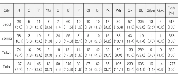
The analysis result for main colors extracted from each collection (518 colors in Seoul collection, 378 colors in Beijing collection, and 882 colors in Tokyo collection) is shown in Table 3. For main color, Seoul collection used achromatic colors(68.5%) and chromatic colors(31.5%), Beijing collection used achromatic colors(53.2%) and chromatic colors(46.8%), and Tokyo collection used achromatic colors(57.2%) and chromatic colors(42.8%).
Same as the overall color characteristics, all three collections used more achromatic colors as main color rather than chromatic colors.
Especially, Seoul collection used achromatic colors 10% more than the other collections. By color, Seoul collection used Bk (39.6%), Wh (15.4%), B (11.6%), Gy (11.0%), and R (5.0%), Beijing collection used Bk (31.4%), B (14.6%), Gy (11.4%), and R (10.1%) / Wh (10.1%), and
Table 3. Main Color of 2014-15 F/W Collections Frequency (%)
City R O Y YG G B P Ol Br Pk Wh Gy Bk Silver Gold Total
(%)
Seoul 26 (5.0)
5 (1.0)
11 (2.1)
3 (0.6)
7 (1.4)
60 (11.6)
10 (1.9)
10 (1.9)
10 (1.9)
17 (3.3)
80 (15.4)
57 (11.0)
205 (39.6)
13 (2.5)
4 (0.8)
517 (100)
Beijing 38 (10.1)
3 (0.8)
10 (2.6)
7 (1.9)
24 (6.3)
55 (14.6)
8 (2.1)
5 (1.3)
10 (2.6)
16 (4.2)
38 (10.1)
43 (11.4)
119 (31.4)
1 (0.3)
1 (0.3)
378 (100)
Tokyo 74 (8.4)
16 (1.8)
25 (2.8)
3 (0.3)
19 (2.2)
131 (14.8)
14 (1.6)
12 (1.4)
42 (4.8)
32 (3.7)
79 (9.0)
139 (15.6)
282 (32.0)
5 (0.6)
9 (1.0)
882 (100)
Total 137 (7.7)
24 (1.4)
46 (2.6)
13 (0.7)
50 (2.8)
246 (13.8)
32 (1.8)
27 (1.5)
62 (3.5)
65 (3.7)
197 (11.1)
239 (13.4)
606 (34.1)
19 (1.1)
14 (0.8)
1777 (100)
Table 4. Sub Color of 2014-15 F/W Collections Frequency (%)
City R O Y YG G B P Ol Br Pk Wh Gy Bk Silver Gold Total
(%)
Seoul 32 (7.0)
6 (1.3)
13 (2.9)
1 (0.2)
7 (1.5)
43 (9.5)
6 (1.3)
6 (1.3)
13 (2.9)
37 (8.1)
91 (20.0)
74 (16.4)
108 (23.9)
6 (1.3)
11 (2.4)
454 (100)
Beijing 27 (6.9)
3 (0.8)
15 (3.8)
11 (2.8)
19 (4.8)
65 (16.5)
19 (4.8)
7 (1.8)
14 (3.6)
10 (2.5)
51 (12.9)
57 (14.5)
80 (20.3)
10 (2.5)
6 (1.5)
394 (100)
Tokyo 77 (7.0)
28 (2.5)
40 (3.6)
7 (0.6)
28 (2.5)
175 (15.8)
37 (3.3)
18 (1.6)
63 (5.7)
45 (4.0)
152 (13.8)
199 (18.0)
219 (19.9)
10 (0.9)
9 (0.8)
1107 (100)
Total 136 (7.0)
37 (1.9)
68 (3.5)
19 (1.0)
54 (2.8)
283 (14.5)
62 (3.2)
31 (1.6)
90 (4.6)
92 (4.7)
294 (15.0)
330 (16.9)
407 (20.8)
26 (1.3)
26 (1.3)
1955 (100)
Tokyo collection used Bk (32.0%), Gy (15.6%), B (14.8%), Wh (9.0%), and R (8.4%). For main color, proportions of Bk, Wh, Gy, B, and R were high in the three collections and, among those colors, Bk was used the most.
On the other hand, the analysis result for sub colors extracted from each collection (454 colors in Seoul collection, 394 colors in Beijing collection, and 1,107 colors in Tokyo collection)
is shown in Table 4. Seoul collection used achromatic colors(61.6%) and chromatic colors(38.4%), Beijing collection used achromatic colors(50.2%) and chromatic colors(49.8%), and Tokyo collection used achromatic colors(52.6%) and chromatic colors(47.4%). Also for sub color, all three collections used more achromatic colors and Seoul collection showed big difference by using
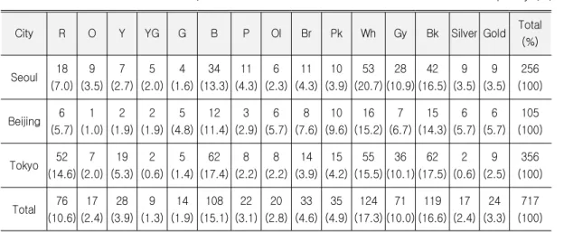
Table 5. Accent Color of 2014-15 F/W Collections Frequency (%)
City R O Y YG G B P Ol Br Pk Wh Gy Bk Silver Gold Total
(%)
Seoul 18 (7.0)
9 (3.5)
7 (2.7)
5 (2.0)
4 (1.6)
34 (13.3)
11 (4.3)
6 (2.3)
11 (4.3)
10 (3.9)
53 (20.7)
28 (10.9)
42 (16.5)
9 (3.5)
9 (3.5)
256 (100)
Beijing 6 (5.7)
1 (1.0)
2 (1.9)
2 (1.9)
5 (4.8)
12 (11.4)
3 (2.9)
6 (5.7)
8 (7.6)
10 (9.6)
16 (15.2)
7 (6.7)
15 (14.3)
6 (5.7)
6 (5.7)
105 (100)
Tokyo 52 (14.6)
7 (2.0)
19 (5.3)
2 (0.6)
5 (1.4)
62 (17.4)
8 (2.2)
8 (2.2)
14 (3.9)
15 (4.2)
55 (15.5)
36 (10.1)
62 (17.5)
2 (0.6)
9 (2.5)
356 (100)
Total 76 (10.6)
17 (2.4)
28 (3.9)
9 (1.3)
14 (1.9)
108 (15.1)
22 (3.1)
20 (2.8)
33 (4.6)
35 (4.9)
124 (17.3)
71 (10.0)
119 (16.6)
17 (2.4)
24 (3.3)
717 (100)
achromatic colors 10% more than the other two collections. By color, Seoul collection used Bk (23.9%), Wh (20.0%), Gy (16.4%), B (9.5%), Pk (8.1%), and R (7.0%), Beijing collection used (20.3%), B (16.5%), Gy (14.5%), Wh (12.9%), and R (6.9%), and Tokyo collection used Bk (19.9%), Gy (18.0%), B (15.8%), Wh (13.8%), and R (7.0%). Also for sub color, proportions of Bk, Wh, Gy, B, and R were high in all three collections. Seoul collection showed difference by using Pk other than five colors above.
The analysis result for accent colors extracted from each collection (256 colors in Seoul collection, 105 colors in Beijing collection and 356 colors in Tokyo collection) is shown in Table 5. For accent color, Seoul collection used achromatic colors(51.6%) and chromatic colors (48.4%), Beijing collection used achromatic colors(41.9%) and chromatic colors(58.1%), and Tokyo collection used achromatic colors(43.7%) and chromatic colors(56.3%). In Seoul collection, the use of achromatic color was higher than chromatic color for accent color, while Tokyo and Beijing showed more usage of achromatic colors. As the two collections used chromatic
colors 10% more than Seoul collection, it suggests that there was a big difference among three collection for the use of chromatic/achromatic color. By color, Seoul collection used Wh (15.2%), Bk (14.3%), B (11.4%), Pk (9.6%), and Br (7.6%), Beijing collection used Wh (15.2%), Bk (14.3%), B (11.4%), Pk (9.6%), and Br (7.6%), and Tokyo collection used (17.5%), B (17.4%), R (14.6%), Wh (15.5%), and Gy (10.1%). Seoul and Tokyo collection, same as in sub color, the proportions of Bk, Wh, Gy, B, and R were high, while Pk and Br were higher than Gy and R in Beijing collection. It shows that there was difference in color use by main, sub, and accent color.
The overall characteristics of main, sub, accent color in Korea, China, and Japan collections can be summarized as follows: Seoul collection showed more frequent use of achromatic color in overall. In Beijing and Tokyo collection, the proportion of achromatic color was higher than that of chromatic colors in main and sub colors while the proportion of chromatic color was higher in accent color. When put together, the three collections showed different
characteristics for using main, sub and accent colors. Especially, Seoul collection used achromatic colors over 50% for main, sub and accent colors and used achromatic colors 10%
more than the other collections. This showed the proportion of achromatic color was high in Seoul collection.
2. Comparison between Korea, China and Japan Collections’ Color and Carlin’s Trend Color
In overall, basic colors like Bk, Wh and Gy which are frequently used in F/W color plan were used a lot as well as warm colors like Br and R. Especially, the use of Bk, Wh and R is identical to color forecast by Carlin suggested with the keyword of ‘Splendor’.
Purple blue color suggested with the keyword of ‘Boreal' in Carlin is included in B for ISCC-NBS system. The result of research showed that B used frequently in overall with the high proportion of 14.3%. By collection, the proportion of using B was 11.2% in Seoul collection, 15.1% in Beijing collection, and 15.7% in Tokyo collection. It suggests that the use of B was the highest in Tokyo collection and the lowest in Seoul collection. But Pk which was suggested together and again with the keyword of ‘Sensitive’ was used a little with the overall proportion of 4.3%. By collection, the proportion of using Pk was 5.3% in Seoul collection, 4.1% in Beijing collection, and 3.9%
in Tokyo collection. It suggests that the use of Pk was the highest in Seoul collection and the lowest in Tokyo collection. This was different from the result of B which was suggested together.
Metallic color suggested with the keyword of
‘Brave New World’ showed negligible use. In
overall, it occupied 2.8%. By collection, Seoul collection showed Silver 2.3% and Gold 2.0%, Beijing collection showed Silver 1.9% and Gold 1.5%, and Tokyo collection showed Silver 0.7%
and Gold 1.2%.
Same as the overall characteristics, Bk, Wh, B, and R showed high proportion in main and sub color. All three collections showed the highest proportion of Bk among trend colors.
Especially, in Seoul collection, Bk was used for 39.6% of main color. For accent color, Bk was used most frequently in Tokyo collection, while Wh was used most frequently in Seoul and Beijing collections. Additionally, for the proportion of trend color, Bk, Wh, B, and R were commonly used for accent color in Seoul and Tokyo collections, while Pk and Br was used more frequently rather than R in Beijing collection.
Metallic color and Pk color which were used in low proportion in overall color characteristics showed high proportion or low proportion by main, sub and accent color per collection.
Above all, in Seoul collection, the use of Pk was high in sub color for the proportion of 8.1% and the use of metallic color was high in accent color for the proportion of 7%. In Beijing collection, Pk and metallic color were used frequently for 9.6% and 11.4% of accent color, respectively. In Tokyo collection, Pk was used in main, sub and accent color similarly for about 4% and metallic color showed high proportion for accent color similar to Seoul and Beijing collections.
Although the Gy color was not a trend color proposed by Carlin, it was used in high proportion. It could be associated with the fact that other information companies such as Promostly or Inter-color proposed Gy as a trend color.
The result of the comparison between Korea, China and Japan collections’ color and Carlin’s 2014-15 F/W trend color can be summarized as follows. All three collections showed high proportion of Bk, Gy, Wh, R and B for main, sub and accent color and it confirmed that Bk, Wh, R and B, which are trend color, are used frequently in all aspects. The use of metallic color and Pk was not frequent as trend color and it suggested that there is a difference in utilization of main, sub and accent color.
V. Conclusion
East Asian countries, Korea, China and Japan, are growing their influence in the world in the aspects of economy, culture and politics. From a view of the close relationship between fashion industry and economy, culture and politics, the fashion of Korea, China and Japan will influence in leading a world fashion trend with the four major collections. Especially, color is one of design factor and one of the main factors to buy clothes. For this, the study analyzed color used in 2014-15 F/W women's ready-to-wear collections in Seoul, Beijing and Tokyo and identified the color characteristics of women’s apparel in three countries by the comparison of a 2014-15 F/W color trend. The summarized result of the comparison analysis is as follows.
First, the analysis result for the total colors of Seoul, Beijing and Japan collections showed more use of achromatic color than that of chromatic color for all thee collections.
Especially, Seoul collection used achromatic colors about 15% more and Beijing collection used most chromatic colors among three collections. In overall color characteristics, Bk was used most frequently in all three collections.
Such characteristic was same in main color. In sub color, Seoul collection used achromatic colors about 10% more than the other collections and used Bk frequently as well as the characteristics of overall and main color. In accent color, Seoul collection showed higher utilization of achromatic color, while Tokyo and Beijing showed higher utilization of chromatic colors.
Second, the comparison between Korea, China and Japan collections and 2014-15 trend color suggested by Carlin showed that Bk, Wh and R suggested with the keyword of ‘Splendor’ and B suggested with the keyword of ‘Boreal' were frequently used. However, metallic color suggested with the keyword of ‘Brave New World‘ showed rare use as all three collections used it 3-5% and showed low utilization.
Additionally, Pk suggested with the keywords of
‘Sensitive’ and ‘Boreal’ also showed low utilization with the proportion of 4-5%. Bk, Wh, R, and B utilized frequently showed high proportion for main, sub and accent color in all three collections, while metallic color and Pk which are trend color with low utilization showed different characteristics by main, sub and accent per collection.
The result of the study so far suggests that, in overall, BK, Wh, Gy, R, and B were used frequently with difference per collection.
Additionally, the other colors showed different aspect and it suggests different use or color characteristics and trend color per collection.
Color database for 2014-15 F/W women’s ready-to-wear collections in Korea, China and Japan established by this study can be utilized for the related academia as well as color plan for fashion industry. Since, however, the scope of the study was limited to colors collected from 2014-15 F/W collections and only hue excluding
tone was analyzed, more discussion is required for generalization. Therefore, there is a need for the grasp of a color trend shown in Seoul, Beijing and Tokyo collections by accumulating data through the continuous research for the relevant topic. In the further research, the author would like to contribute to establishing the foundation of research data for the understanding of a mega trend in Korea, China and Japan fashion collections by expanding the scope of study to the characteristics of hue and coloration for more seasons.
References
Bill, E. (2008/2010). 라이벌 : 글로벌 패권을 둘러 싼 중국 인도 일본의 미래전략. . 〔How the power struggle between China, India and Japan will shape our next decade . Seoul: RH Korea.〕 Carlin. (2014). Retrieved from http://www.itnk.
co.kr/news/articleView.html?idxno=42107.
Carlin trend color. (2014). Retrieved from http://www.ktnews.com/htm/view.asp?idx=919&
GotoPage=1
China fashion week. (2008). Retrieved from http://www.efu.com.cn/data/2008/2008-03-19/
232177.shtml
China fashion week. (2014). Retrieved from http://english.chinafashionweek.org/gywm_en/2 01202/t20120214_893212.html
Ha, S. (2014). A study on the improvement of the national brand inked the composition of Dongdaemum special fashion zone and the development of Seoul collection (Unpublished master’s thesis). Hankuk University of Foreign Studies, Seoul, Korea.
Han, Y. (2005). Study on the present situation and the meaning of cultural industry of the Korean wave fever: Based on the study on
the industrial aspect Korean wave (Unpublished master’s thesis). Sungkyunkwan University, Seoul, Korea.
IMF. (2013). Retrieved from http://www.imf.org/.
Jang, Y. (1998). The study of Korean fashion trend color system (Unpublished master’s thesis). Ewha University, Seoul, Korea.
Japan fashion collection. (2013). Retrieved From http://www.zakzak.co.jp/society/domestic/news /20130319/dms1303190709001-n1.
Jung, K. (2012). An analysis of design characteristics of Asian new luxury brands in world fashion collections (Unpublished doctoral dissertation). Chonnam National University, Gwangju, Korea.
Kate, S., & Debra, J. C. (2012). Fashion color forecasting. (H. Lee, Trans.). Seoul: Biz and biz. (Original work published 2013)
Kim, S. Soomin . (2008).〔 〕 A study on the development strategies of SFAA·Seoul collection (Unpublished master’s thesis).
Dongduk University, Seoul, Korea.
Kim, S. 〔Sooyoun . (2001).〕 Characteristics of colors on fashion collection in early 1990s (Unpublished master’s thesis). Yonsei University, Seoul, Korea.
Kim, S. 〔Sooyoung . (2008). The image and〕 color characteristics of metallic color on contemporary fashion (Unpublished master’s thesis). Yonsei University, Seoul, Korea.
Kim, H. (2013, October 26). China fashion week, Chic News. Retrieved from http://fashion.
mk.co.kr/view.php?no=1039349&year=2013.
Kim, Y., Lee, H., & Lee, Y. (1999). A comparative study on fashion colors forecasted by the Premie re Vision and the` Samsung trend book. Yonsei Journal of Human Ecology, 13, 22-30.
Koh, Y. (2011). An analysis on the fashion colors in New York fashion collections
according to business fluctuations (Unpublished doctoral dissertation). Yonsei University, Seoul, Korea.
Koh, Y., & Lee, J. (2013). A study of color differences in women's ready-to-wear collections from world fashion cities: Intensive study of the Fall/Winter 2010 collections from New York, London, Milan, and Paris. Color Research and Application, 38(6), 463-468.
Lee, C. (2010). 신아시아 경제론 [New Asia Economy]. Seoul: Dunam.
Lee, J. (2013). 신 한류와 문화이동의 지형학 [New Korea n wave and cultural topography].
Seoul: Nonhyung.
Park, (2000). Comparative study on fashion trends between korean and foreign fashion collections in the 1990s. (Unpublished master’s thesis). Seoul University, Seoul, Korea.
Tokyo-fashion week. (2012). Retrieved From http://ja.wikipedia.org/wiki/%E6%9D%B1%E4%B A%AC%E3%82%B3%E3%83%AC%E3%82%AF%
E3%82%B7%E3%83%A7%E3%83%B3
Tokyo-mb fashion week. (2014). Retrieved from http://tokyo-mbfashionweek.com/en/aboutus/
Won, E. (2014). A comparative study of the colors shown on the websites for the national image promotion activities of Korea, China, and Japan (Unpublished master’s thesis).
Hongik University, Sejong, Korea.
Yune, J., & Kim, Y. (2004). The images of fashion design transmitted by achromatic colors. Journal of the Korean Society of Costume, 55(3), 122-135.
Received (November 16, 2014) Revised (December 12, 2014) Accepted (December 12, 2014)